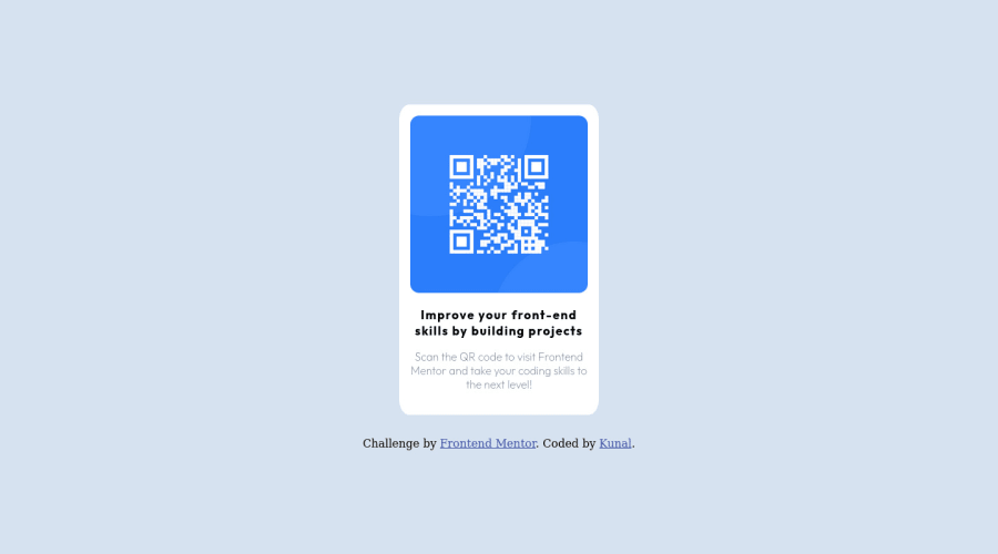
Design comparison
Solution retrospective
All comments are appreciated, and if you have any suggestions for improving my code, please let me know.
Community feedback
- @MelvinAguilarPosted almost 2 years ago
Hello 👋. Congratulation on successfully completing your first challenge 🎉 ! !
I have some recommendations regarding your code that I believe will be of great interest to you.
HTML 📄:
- The <div> tag can be useful for styling and positioning, but it doesn't convey any semantic meaning. Instead, consider using more semantic elements like <p> to better describe the type of content. e.g.:
<p>Scan the QR code to visit Frontend Mentor and take your coding skills to the next level</p>.
Alt text 📷:
-
To make the alt attribute as useful and effective as possible, avoid using words such as "image", "photo", or "picture" as they are redundant because the image tag already conveys that information. Instead, try to make the description as human-readable and understandable as possible.
The alt attribute should explain the purpose of the image, for example, in the case of a QR code, a description like "qr code to frontendmentor.io" would be more appropriate.
If you want to learn more about the
altattribute, you can read this article. 📘.
I hope you find it useful! 😄 Above all, the solution you submitted is great!
Happy coding!
Marked as helpful1 - The <div> tag can be useful for styling and positioning, but it doesn't convey any semantic meaning. Instead, consider using more semantic elements like <p> to better describe the type of content. e.g.:
- @HassiaiPosted almost 2 years ago
Replace <div class="card"> with the main tag to fix the accessibility issues. click here for more on web-accessibility and semantic html
To center .card-container on the page using flexbox, replace the height in .card with min-height: 100vh.
Replace the height in .card with a padding value for all the sides, this will prevent the content from overflowing on smaller screens and its a responsive replacement.
padding: 1rem. Give the img a max-width of 100% and a border-radius value.Give .description a margin value for all the sides, and a font-size of 15px which is 0.9375rem, this will be the font-size of both p and h1.
Hope am helpful.
Well done for completing this challenge. HAPPY CODING
0
Please log in to post a comment
Log in with GitHubJoin our Discord community
Join thousands of Frontend Mentor community members taking the challenges, sharing resources, helping each other, and chatting about all things front-end!
Join our Discord
