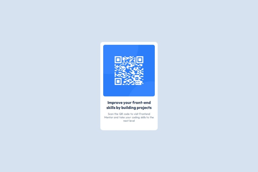


Design comparison

Solution retrospective
I'm proud of deploying my first website using Github.
What challenges did you encounter, and how did you overcome them?Matching the design's measurements was not straight forward. I used trial and error to approximate the solution.
What specific areas of your project would you like help with?I'm not planning on using Figma. Are there tools or ways to measure margin, letter spacing, etc... from the design images?
I would also appreciate some feedback on mistakes I might have and what can I do to improve my code?
Community feedback
- @grace-snowPosted 7 months ago
Well done on the solution.
You don't need to waste time measuring everything, just get these solutions close and that's fine. In a real job you will always have design files and should be given variables anyway.
There are a few points for improvement on this though..I hope these are helpful!
- you don't need a section for the text content inside the card. You're only adding that for a layout purpose. It's fine to use divs for that! This isn't what a section is for and makes the code less reasonable by trying to present the text in the card as its own component.
- When you build single component demos like this try to think about the context of where it would be used in a real site. This is a card, likely to sit on a page somewhere maybe with other cards. It would never be used to serve up the main heading for a page of content, so that tells you it wouldn't ever be a h1. Use a lower importance heading level like h2.
- get into the habit of including a full modern css reset at the start of the styles in every project. What you have now isn't what I mean. Look up Andy Bell's or Josh Comeaus. Both have good explainers.
- I strongly recommend you don't resize the html font size to 62.5%! I've written all about this and encourage you to read it.
- don't give the component an explicit width or it won't be able to adapt when it needs to. Instead, give it a max width in rem (optionally it can have width 100% as well). This let's the card go narrower if it needs to eg on a smaller screen, and using rem means the layout will scale correctly for all users including those who have a different text size setting.
Marked as helpful1@ayx234Posted 7 months ago@grace-snow
Hello grace,
Thank you for your detailed reply! I updated my code with your suggestions, and appreciate having professional feedback and your article.
How do I know when it's appropriate to use divs? I try to avoid them for accessibility concerns, but from your feedback I understand they are ok to use for layout purposes? when do they cause accessibility issues?
0@grace-snowPosted 7 months ago@ayx234 they dont cause accessibility issues. The sections you're using are actually exactly the same as divs - they are meaningless unless they are labelled. It's only once a section is given an accessible name (e.g.
aria-label) that it becomes a landmark and is called out in the accessibility tree.The point here is more about code readability. This is only one card. It's one section of content and should be treated as one, not two or more.
The important landmarks for accessibility are really the core structural landmarks of a page — header and/or nav, main, and footer.
Marked as helpful1 - @DAJ350Posted 7 months ago
Hey, great work on this project! You have used Semantic HTML quite well. I am also impressed by the use of the custom CSS properties. I plan to try this out on my next project.
To answer your question about measuring margins, letter spacing etc...
You can use design software like Photoshop, GIMP, or Paint.NET, which have built-in rulers, grids, and measurement tools to get pixel-perfect distances between elements.
How to Use:
- Import the JPG file.
- Use the built-in ruler or grid tools to measure margins, padding, letter spacing, etc.
Many tools allow you to drag guide lines to measure pixel-perfect distances.
Hope that helps.
Happy Coding!
Marked as helpful1


Please log in to post a comment
Log in with GitHubJoin our Discord community
Join thousands of Frontend Mentor community members taking the challenges, sharing resources, helping each other, and chatting about all things front-end!
Join our Discord