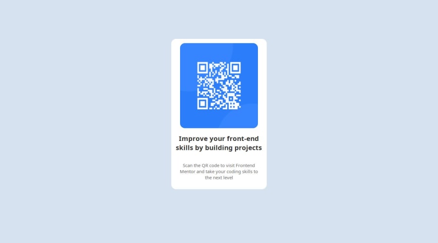
Design comparison
Solution retrospective
Questions:
- I have added media queries in the style tag of index.html, but its not working when i open the file locally it worked but when I upload the files to Github it's not working.Why is that?
Community feedback
- @Bishalsnghd07Posted 9 months ago
Hi, @Murtazaamin39๐
Congrats for completing this challenge๐ and you did a good job๐
I have some suggestion for you, might it be helpful:
1)First of all don't use Github for hoisting your site, it's only use for tracking and saving your local repo into it. By any chance if your local repo get deleted from your pc, then from Github(cloud) you can clone it and reuse it in your local codebase again. For, this purpose github should be used, sometime static files can run on github, sometimes not. So, better to host your site on hoisting website like vercel or netlify for free. Give a try is it solving your issue or not.
2)And Second, this challenge did not need media queries any where, You just have to center your layout in body or in main landmark(main container) by this property ๐ ``` body {
Display: flex; ( can also be use grid will work same ) flex-direction: column; justify-content: center;( center your div vertically ) align-items: center;( center your div horizontally ) min-height: 100vh;(it ensures an element always maintain a minimum height, even the content is insufficient) padding: 0.5rem;( by giving padding should maintain your layout in mobile view also) }
And at last you have to give
max-width
to the child div's and adjust in a way that width will set perfectly in smaller screen and as well as in larger screen. Just do a little bit play with it and you will get your desire result.Hope this small tips will help you ahead in your future projects too.
Once again Welcome to Frontend Mentor, wishing you a joyful journey ahead and Happy Codingโค๏ธ
0 - @Ezekiel225Posted 9 months ago
Hello there ๐
Good job on completing the challenge !
Your project looks really good!
I have suggestions about your code that might interest you.
๐ First: Use
<main>
to wrap the main content instead of<div>
.Tags like
<div>
and<span>
are typical examples of non-semantic HTML elements. They serve only as content holders but give no indication as to what type of content they contain or what role that content plays on the page.๐If you don't have the Figma design files, I recommend using a browser extension called Perfect Pixel.
It allows you to compare your finished project with the design images that come along when you download the project and check the (almost exact) dimensions. It's very useful!
Learn more about Media Queries: Media queries are an essential part of responsive web design. They allow you to apply different CSS styles based on the characteristics of the device, such as screen width, height, orientation, and resolution. You can start by reading articles or tutorials on media queries to understand how they work and how to use them effectively.
Practice: The best way to become familiar with media queries is to practice using them in your projects. Start with simple layouts and gradually increase complexity as you gain confidence. Experiment with different breakpoints and CSS rules to see how they affect the layout on various devices.
Use a Mobile-First Approach: One popular strategy for responsive design is the mobile-first approach. This means designing the layout for mobile devices first and then adding styles for larger screens using media queries. This approach helps ensure that your website looks good on small screens and then adapts to larger screens.
I hope this suggestion is useful for future projects.
Other than that, great job!
Keep up the excellent work and continue to challenge yourself with new projects. Your progress is impressive, and each project is a step forward in your front-end development journey! ๐๐.
Happy coding.
0
Please log in to post a comment
Log in with GitHubJoin our Discord community
Join thousands of Frontend Mentor community members taking the challenges, sharing resources, helping each other, and chatting about all things front-end!
Join our Discord