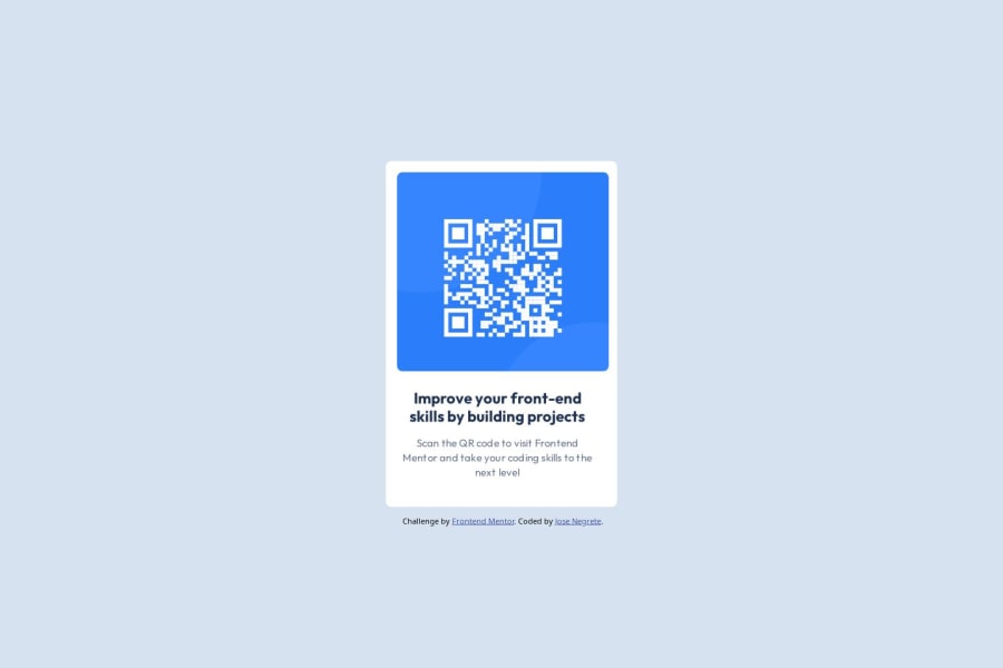
Design comparison
Solution retrospective
Most proud on how I figured out the implementation of including a background image. Next time I would try to figure out the sizes of each aspect of the project to better work on it.
What challenges did you encounter, and how did you overcome them?The main challenge was just getting overwhelmed at first. I overcame it by taking it step-by-step, figuring out how each element should work and how to classify them as well.
What specific areas of your project would you like help with?I would like help with figuring out the size of the body element. I had to eyeball the size and would love to see if there's an easier way to find the right dimensions. Also would love help on the background image and how to implement it and have it fit into the content box.
Community feedback
Please log in to post a comment
Log in with GitHubJoin our Discord community
Join thousands of Frontend Mentor community members taking the challenges, sharing resources, helping each other, and chatting about all things front-end!
Join our Discord
