

Design comparison

Community feedback
- P@Islandstone89Posted 7 months ago
Hi there.
Congratulations, you have done an excellent job!
Some of the things you've done well:
-
margin: 1remon the card(you could also usepadding: 1remon thebody) to prevent the card from getting squished on smaller screens. -
Centering the card using Flexbox and
min-heightinstead ofheight. -
No fixed widths or heights in
px. -
max-widthin rem on the card to prevent it from getting too wide on larger screens. -
Setting
font-sizein rem instead ofpx, which is vital for accessibility.
A few suggestions to improve your solution even further:
HTML:
-
Every webpage needs a
<main>that wraps all of the content, except for<header>andfooter>. This is vital for accessibility, as it helps screen readers identify a page's "main" section. Wrap the card in a<main>. -
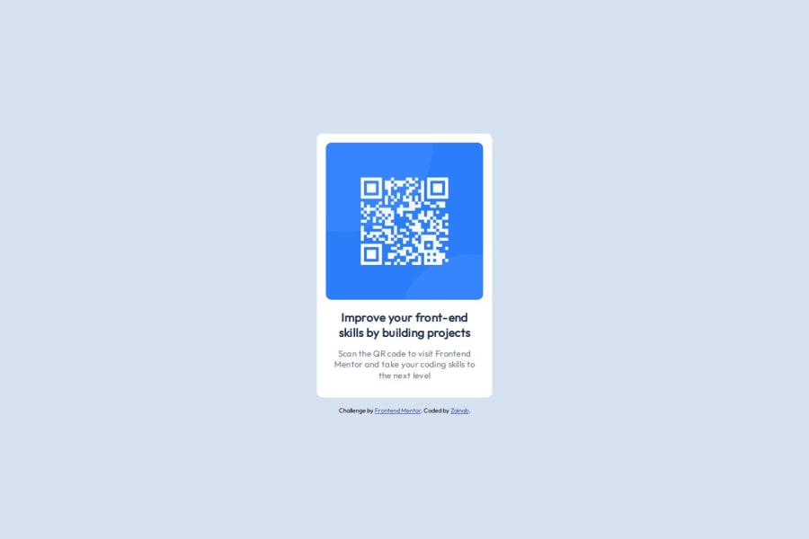
The alt text must also say where it leads(the frontendmentor website). Do not include words like "image" or "photo" , as screen readers announce that by default. A good alt text would be "QR code leading to the Frontend Mentor website."
-
Change
.attributionto a<footer>, and move it outside of<main>.
CSS:
-
Including a CSS Reset at the top is good practice.
-
On the
body, addflex-direction: columnandgap: 2rem. -
Paragraphs have a default value of
font-weight: 400, so there is no need to declare it. -
Since all of the text should be centered, you only need to set
text-align: centeron the body, and remove it elsewhere. The children will inherit the value. -
On the image, add
display: blockand changewidthtomax-width: 100%- the max-width prevents it from overflowing its container. Without this, an image would overflow if its intrinsic size is wider than the container.max-width: 100%makes the image shrink to fit inside its container. -
Instead of
.text > .text-2, it's better to use a single class selector (.text-2), as this keeps the specificity low and flat.
Keep up the good work! :)
1 -


Please log in to post a comment
Log in with GitHub
Join our Discord community
Join thousands of Frontend Mentor community members taking the challenges, sharing resources, helping each other, and chatting about all things front-end!
Join our Discord