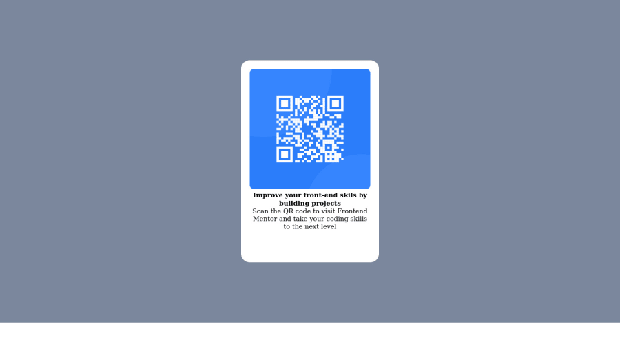
Design comparison
SolutionDesign
Community feedback
- @correlucasPosted about 2 years ago
👾Hi , congratulations on your solution!👋 Welcome to the Frontend Mentor Coding Community!
Great solution and a great start! From what I saw you’re on the right track. I’ve few suggestions for you that you can consider adding to your code:
- When you download the project files there’s a file called
style-guide.mdwhere you can find information such ashsl color codesand thefont-sizefor the headings. The background-color in this case isbackground-color: #D5E1EFh5 to show the hierarchy of your titles in the level of importance, never jump a level. - Add a margin of around
margin: 20pxto avoid the card touching the screen edges while it scales down. - Use relative units as
remoreminstead ofpxto improve your performance by resizing fonts between different screens and devices. These units are better to make your website more accessible. REM does not just apply to font size, but to all sizes as well.
Here's my solution for this challenge if you wants to see how I build it: https://www.frontendmentor.io/solutions/qr-code-component-vanilla-cs-js-darklight-mode-nS2aOYYsJR
✌️ I hope this helps you and happy coding!
0 - When you download the project files there’s a file called
Please log in to post a comment
Log in with GitHubJoin our Discord community
Join thousands of Frontend Mentor community members taking the challenges, sharing resources, helping each other, and chatting about all things front-end!
Join our Discord
