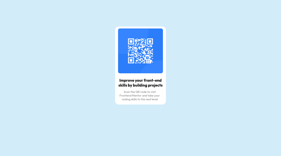
Design comparison
Solution retrospective
Please tell if there's any other easier method to make this challenge complete and what is the color of background which is present in the question?
Community feedback
- @denieldenPosted almost 3 years ago
Hi yAshr, good job! Congratulations on completing the challenge.
I had a look at your solution and I have a few suggestions for you:
- remove the
margin
andtop
property fromcard
class. - remove
max-width
from body - use Flexbox for center the card to the body. Read here -> flex guide
- add
heigth: 100vh
to body because Flexbox aligns to the size of the parent container - Adding
main
tag for Accessibility and wrap the card inside
Hope this help and happy coding :)
Marked as helpful1 - remove the
- Account deleted
Hello there! 👋
Congratulations on finishing your challenge! 🎉
I have some feedback on this solution:
-
Always Use Semantic HTML instead of
div
like<main>
<header>
, etc for more info -
Remove the position,margin, etc from the card element add to the body these properties to center the card
display:flex: justifiy-content; center; align-items:center; min-height:100vh;
and remove the max-width from the body -
Add A Max Width to there paragraph to make it look exactly like the design
max-width:240px
if my solution has helped you do not forget to mark this as helpful!
Marked as helpful1 -
- @NaveenGumastePosted almost 3 years ago
Hay ! yAshr Good Job on challenge
These below mentioned tricks will help you remove any Accessibility Issues
-> Add Main tag after body
<main class="container"></main>
-> Learn more on accessibility issues
Keep up the good work!
0
Please log in to post a comment
Log in with GitHubJoin our Discord community
Join thousands of Frontend Mentor community members taking the challenges, sharing resources, helping each other, and chatting about all things front-end!
Join our Discord