Design comparison
SolutionDesign
Community feedback
- @dtp27Posted over 2 years ago
Hi Robert!
Congrats on your first challenge, and welcome the Frontend Mentor!
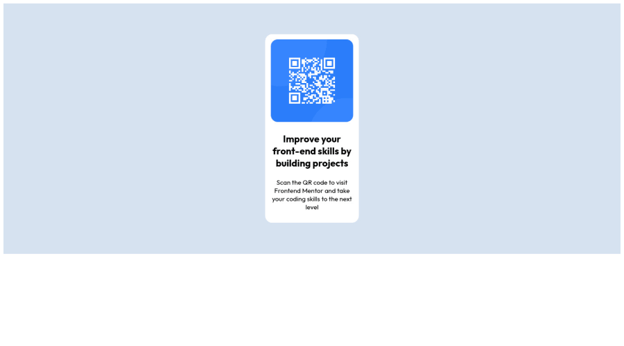
Great first solution! One thing I would recommend is setting the min height in the body element to ensure that the background color takes up the entire viewing area and also the component gets centered properly. You can then also use flexbox on the body to center the entire component:
body {
  min-height: 100vh;
  display: flex;
  justify-content: center;
  align-items: center;
}
Hope this helps. Happy coding!
Dan
Marked as helpful0
Please log in to post a comment
Log in with GitHubJoin our Discord community
Join thousands of Frontend Mentor community members taking the challenges, sharing resources, helping each other, and chatting about all things front-end!
Join our Discord
