Not Found
Not Found
Not Found
Not Found
Not Found
Not Found
Not Found
Not Found
Not Found
Not Found
Not Found
Not Found
Not Found
Not Found
Not Found
Not Found
Not Found
Not Found
Not Found
Not Found

Submitted

QR Code Solution via Flex and Basic HTML,CSS

@FatherSword

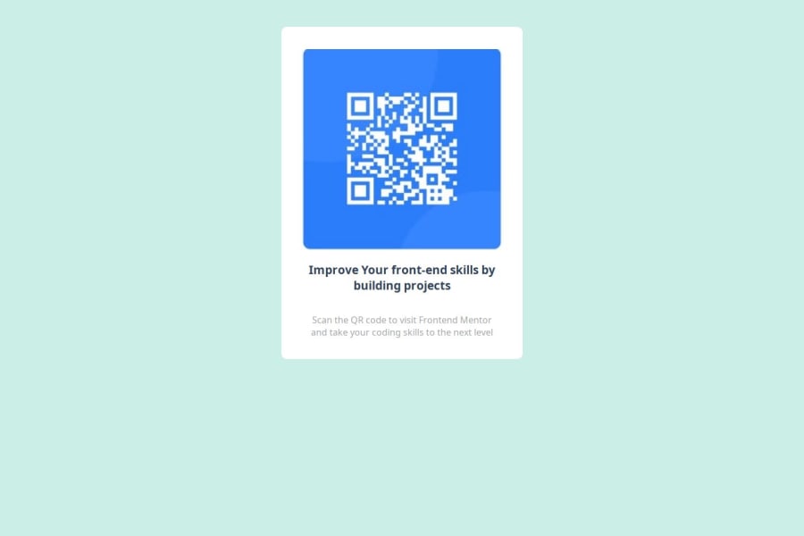
Desktop design screenshot for the QR code component coding challenge

This is a solution for...

  • HTML
  • CSS
1newbie
View challenge

Design comparison


SolutionDesign

Solution retrospective


What are you most proud of, and what would you do differently next time?

I am proud of my journey when I tried to create my first live site project like this. I learned a lot during this process because I was not intended to rush finishing this project, instead, I have read some tutorials about flex and generating live site page, which might help me to do better and more quickly in future development. I believe that I will choose to assign items through "flex-direction:column" if I want to do that again. This can help me refine the automatic expansion of paragraphs and make the page more beautiful.

What challenges did you encounter, and how did you overcome them?

I encountered only a few challenges, because this project is very basic, objectively speaking.

Community feedback

MikDra1 6,920

@MikDra1

Posted

Here is how you can make your card responsive easily

   .card {
       width: 95%;
       max-width: 42.5rem;
   }

On smaller screens, the card will occupy 90% of its parent (such as the body), but once it reaches 42.5rem (680px), it will remain like that.

I hope this tip was useful to you! 💗💗💗

Great work, and keep it up! 😁😊😉

Marked as helpful

2

@FatherSword

Posted

This is a quite easier way to make the page responsive, I can cut down a lot of codes from your sample! Thank you a lot! @MikDra1

0
pmendezpe 30

@pmendezpe

Posted

Great job! The effort and attention to detail are evident in the final result. I really liked how you implemented several media queries, which greatly improved the responsiveness of the design across different devices. As a suggestion, you could pay a bit more attention to the padding in some areas to further refine the layout. Overall, excellent work!

Marked as helpful

0

Please log in to post a comment

Log in with GitHub
Discord logo

Join our Discord community

Join thousands of Frontend Mentor community members taking the challenges, sharing resources, helping each other, and chatting about all things front-end!

Join our Discord