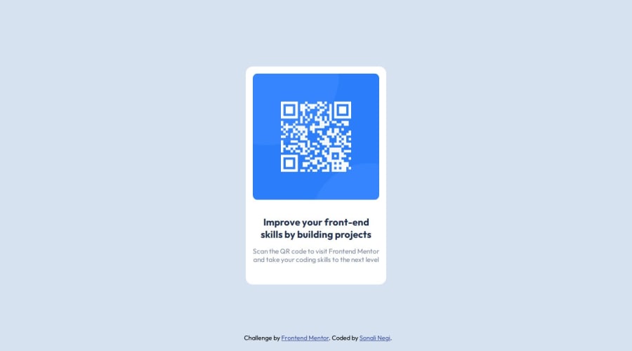
QR code solution using HTML, CSS Flexbox and Media Queries
Design comparison
Solution retrospective
I take pride in the way I organized the HTML and CSS for the QR code component project. One aspect I'm particularly pleased with is my use of CSS variables (--page-bg, --card-bg, --p-color) to maintain a consistent theme throughout the design. One thing I would approach differently in future projects is the need for more descriptive alt text for images to enhance accessibility.
What challenges did you encounter, and how did you overcome them?I did not encounter any significant challenges.
What specific areas of your project would you like help with?I'm satisfied with the overall outcome of my project, but if there are specific areas you believe could be improved or optimized further, I'm open to feedback and suggestions.
Community feedback
Please log in to post a comment
Log in with GitHubJoin our Discord community
Join thousands of Frontend Mentor community members taking the challenges, sharing resources, helping each other, and chatting about all things front-end!
Join our Discord
