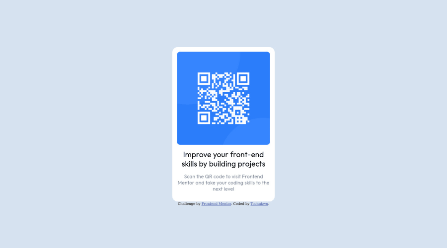
Design comparison
Solution retrospective
Hey guys! I completed my first project on QR code, please help me review it especially the positioning and sizing. here is the links https://tmoney.vercel.app https://github.com/kelvtmoney/qr-code-component-main any suggestions on how to improve is very welcome
Community feedback
- @MelvinAguilarPosted almost 2 years ago
Hello there 👋. Good job on completing the challenge !
I have some suggestions about your code that might interest you.
HTML 🏷️:
- The text 'Scan the QR code to visit Frontend Mentor and take your coding skills to the next level' is a simple paragraph and not a heading (h2).
- The
altattribute should not contain the words "image", "photo", or "picture", because the image tag already conveys that information.
CSS 🎨:
- Instead of using a defined height (
height: 800px;), you can usemin-heightwith a value of100vhto make the section take up the full height of the viewport regardless of the device.
CSS Reset 🔄:
-
You should use a CSS reset. A CSS reset is a set of CSS rules that are applied to a webpage in order to remove the default styling of different browsers.
CSS resets that are widely used:
I hope you find it useful! 😄 Above all, the solution you submitted is great!
Happy coding!
0
Please log in to post a comment
Log in with GitHubJoin our Discord community
Join thousands of Frontend Mentor community members taking the challenges, sharing resources, helping each other, and chatting about all things front-end!
Join our Discord
