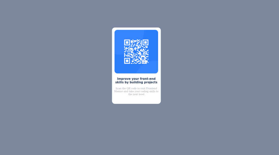
Design comparison
Solution retrospective
Hello. This is my first time doing something like this and found it to be quite an amazing experience. I would like to ask how to properly address issues of padding, spacing, margining, and positioning in my code, especially when it comes to the CSS components. This mainly revolves around which specific code to use, when to use it and how it should be used. Thank you.
Community feedback
- @DavidMorgadePosted about 2 years ago
Hello Kwane welcome to the community and congrats on finishing the challenge!
To answer your question, you normally use those properties as you need them when you can't get the desired results using things like flexbox or css grid.
For example, to center your
section class='box'
, instead of usingmargin
on it, you can remove those margins and center it with flexbox on the parent element with flexbox, try this in your body and tell me how it goes!:body { display: flex; justify-content: center; align-items: center; min-height: 100vh; }
With this few lines of code your component will always be on the center of the screen!
Hope my feedback helps you for future challenges!
Marked as helpful0@thebineyPosted about 2 years ago@DavidMorgade Thank you so much, Mr. David. Once I cleared the margin attributes and used the flex display, the QR code stood exactly at the center of the page. I would like to understand more about the codes you sent over as well as their application and Flexboxes in general. Tried my hands Flexboxes on in the past but they did not seem to make a whole lot of sense to me
1@DavidMorgadePosted about 2 years ago@thebiney Hello Kwame, I can try to explain what happenned with the little snippet code you added:
body { /* Here we select the body, wich is the parent element of your section class='box' wich is the whole component we want to center*/ min-height: 100vh; /* here we set the minimum height of the body to be the whole viewport, it means that in every type of screen, the body will be the whole screen of the browser */ display: flex; /* here we enable flex on the body to center the child components, the only child component is your whole QR box */ align-items: center; /* This will center your component on the Y axis, by default when you use display: flex, the flex-direction is row, when using align-items on flex-direction: row it centers your item on the Y axis, when using flex-direction: column, it centers your child elements in the X axis, since the body occupies the whole screen, this mean that your QR box will be at the center of the screen. */ justify-content: center /* The same as align-items but for centering your child elements on the X axis, when you use it at a flex-direction: column it will center in the Y axis instead */ }
I recommend you to give it a try and learn flex-box, it will help you a lot building layouts, imagine, in a standart landing page I will use flexbox in almost everything, when you get use to it is so easy to make responsive layouts!
0@DavidMorgadePosted about 2 years ago@abdulhasibn It will get you the same result if you set your body height to 100vh, but I have a secret rule, everytime you can use flexbox instead of margins and paddings, use it!
1 - @abdulhasibnPosted about 2 years ago
Hello. Reading your code I got to know some new tips for myself. Thanks for that. I would like to ask, is there any specific reason for declaring the size for border-radius of your QR-code picture, four times. Because declaring it once suffices the need, unless you are planning to add different values for different corners.
1@thebineyPosted about 2 years ago@abdulhasibn declaring this particular border-radius size four times is a bit of a primitive move. You could just declare it once. That would thereby affect all four sides with the given value declared. The same goes for declaring twice. But as for that, takes two sides as a pair and affects each of them
0@thebineyPosted about 2 years ago@abdulhasibn I am not really well vested in CSS at the moment, so I chose to go with the four declarations approach. Many skilled developers would not do this as it makes your work bulky and can potentially make codes run slower.
0
Please log in to post a comment
Log in with GitHubJoin our Discord community
Join thousands of Frontend Mentor community members taking the challenges, sharing resources, helping each other, and chatting about all things front-end!
Join our Discord