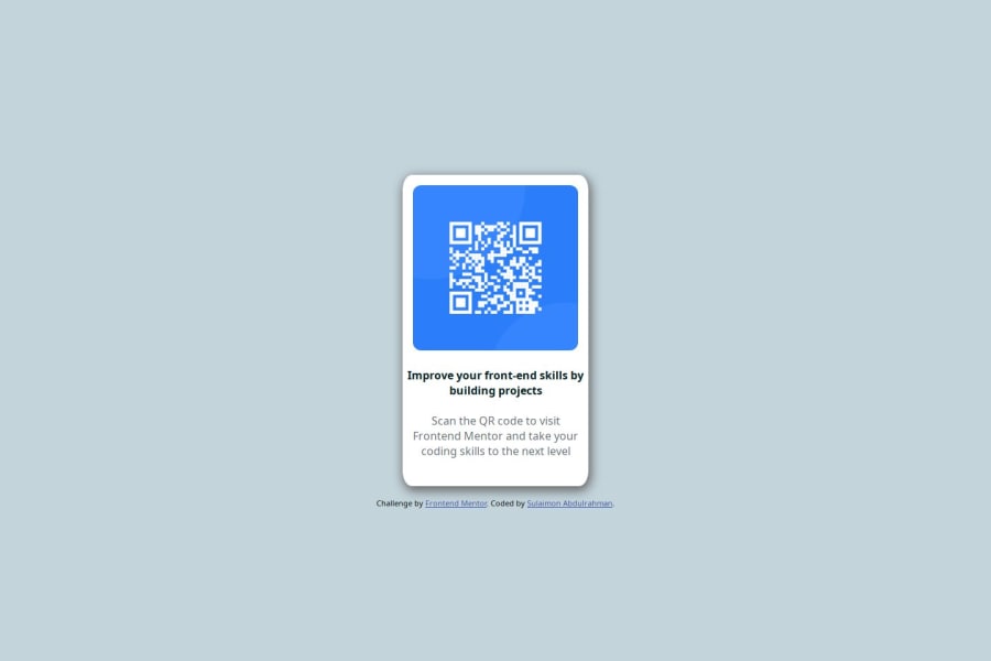
QR-code solution using css grid, box shadow and flexbox
Design comparison
Solution retrospective
I'm proud of the fact that i was able to get the css styling in one go.
What challenges did you encounter, and how did you overcome them?The challenge i encountered was when i had to add the background color. I had to check meny times just before i can get the something close to the one in the image given.
What specific areas of your project would you like help with?I'm not really sure if there is any where in the code where it need to be improved and if there is one, then i'm definitely willing to learn more.
Community feedback
- @Augurk66Posted 3 months ago
Nice work Sulaimon! You can find the background colour in the style-guide.md file. Which is in the package you have downloaded to start this project. I used the "body" tag to give the background the desired colour. The colour for this background is hsl(212, 45%, 89%).
body { background-color: hsl(212, 45%, 89%); }In the style-guide you can also find the specific font of this component. This component uses Google Fonts. You can add those by using the
@import url('https://fonts.googleapis.com/thisisanexamplelink')tag in your css.However using CSS within your HTML file is handy, I strongly recommend you to use a separate .CSS style file. With this method you separate your languages and it makes the code more readable.
Keep it up!
Marked as helpful1@AbdulrahmanololadePosted 3 months agoThank you very much for the feedback. I really appreciate it.@Augurk66
0
Please log in to post a comment
Log in with GitHubJoin our Discord community
Join thousands of Frontend Mentor community members taking the challenges, sharing resources, helping each other, and chatting about all things front-end!
Join our Discord
