

Design comparison

Solution retrospective
I am glad that I could actually do it myself without any help seeing as I kind of rushed myself into front-end web development
What challenges did you encounter, and how did you overcome them?Centering the div 😅
Figuring out the dimensions. And luckily the challenge did not require the page to mobile responsive.
What specific areas of your project would you like help with?I still need help in intricacies like positioning and how various little exact details might affect proper movement/placement of elements
Community feedback
- P@Islandstone89Posted 4 months ago
HTML:
-
Every webpage needs a
<main>that wraps all of the content, except for<header>andfooter>. This is vital for accessibility, as it helps screen readers identify a page's "main" content. Change the first<div>into a<main>. -
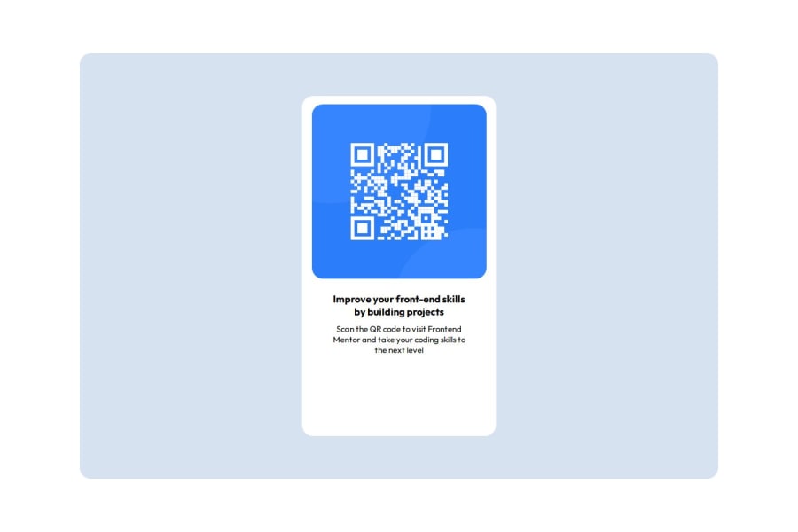
The image has meaning, so it must have proper alt text. Write something short and descriptive, without including words like "image" or "photo". Screen readers start announcing images with "image", so an alt text of "image of qr code" would be read like this: "image, image of qr code". The alt text must also say where it leads(the frontendmentor website). A good alt text would be "QR code leading to the Frontend Mentor website."
-
"Improve your" is a heading. I would make it a
<h2>- a page should only have one<h1>, reserved for the main heading. As this is a card heading, it would likely not be the main heading on a page with several components.
CSS:
-
Including a CSS Reset at the top is good practice.
-
I recommend adding a bit of
padding, for example16px, on thebody, to ensure the card doesn't touch the edges on small screens. -
Move
background: hsl(212, 45%, 89%)to thebody, and removebackground: white. NB: I would usebackground-colorinstead ofbackground. -
.background-bluedoesn't need any styling - delete all of its styles. -
On the
body, changeheighttomin-height: 100svh- this way, the content will not get cut off if it grows beneath the viewport. Remove thewidth, as the body is 100% wide by default. Removeplace-content: center, it doesn't apply withoutdisplay: grid. -
To center the card horizontally and vertically, I would use Flexbox on the body:
display: flex; flex-direction: column; justify-content: center; align-items: center; min-height: 100svh;-
Remove the margin on the card - it is centered with Flexbox.
-
Remove
margin-bottomon.card-content. -
Remove all widths and heights in
pxand%. -
Add a
max-widthof around20remon the card, to prevent it from getting too wide on larger screens. -
font-sizemust never be in px. This is a big accessibility issue, as it prevents the font size from scaling with the user's default setting in the browser. Use rem instead. -
Since all of the text should be centered, you only need to set
text-align: centeron the body, and remove it elsewhere. The children will inherit the value. -
Paragraphs have a default value of
font-weight: 400, so there is no need to declare it. -
On the image, remove the
margin. Adddisplay: block,height: autoandmax-width: 100%- the max-width prevents it from overflowing its container. Without this, an image would overflow if its intrinsic size is wider than the container.max-width: 100%makes the image shrink to fit inside its container. -
To create the space between the image and the edge of the card, set
paddingon all 4 sides of the card:padding: 16px;.
0 -

Please log in to post a comment
Log in with GitHub
Join our Discord community
Join thousands of Frontend Mentor community members taking the challenges, sharing resources, helping each other, and chatting about all things front-end!
Join our Discord