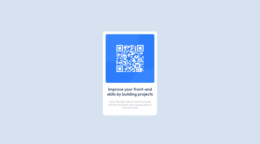
Design comparison
Solution retrospective
Hi there 👋🏾 Please check out my solution and feel free to share your opinions with me. I will really appreciate your constructive feedback. I am on a journey to improve my coding skills, and your insights are more than Welcome.
Note: Any tips on best practices?
THANK YOU IN ADVANCE🎉
Community feedback
- @PhoenixDev22Posted about 2 years ago
Hi Luz De La Rosa,
Congratulation on completing this challenge. Your solution looks great. I have some suggestions regarding your solution if you don’t mind:
- In my opinion, the alternate text should indicate where the Qr code navigate the user : like
QR code to frontend mentor.
(not describes the image)
- Adding rel="noopener" or rel="noreferrer" to target="_blank" links. When you link to a page on another site using
target=”_blank”
attribute , you can expose your site to performance and security issues.
- There are some unnecessary div’s, needed to be removed
Overall Excellent work! Hopefully this feedback helps.
Marked as helpful1@luztherosePosted about 2 years ago@PhoenixDev22 Thank you so much for your feedback :) This will definitely make this and future projects better.
0@luztherosePosted about 2 years ago@PhoenixDev22 I found this information about the rel="noopener"
Note: Setting target="_blank" on <a> elements now implicitly provides the same rel behavior as setting rel="noopener" which does not set window.opener.
https://developer.mozilla.org/en-US/docs/Web/HTML/Link_types/noopener
0 - In my opinion, the alternate text should indicate where the Qr code navigate the user : like
- Account deleted
Hello, Luz. Good job, your design is clean. You have a good html structure and your css too. Just one thing, in this case you don't need to add flex to the
qr-container
, because by default the divs you use for the img and the texts will be placed one below the other. It's just a recommendation, it's not bad, it just wasn't really necessary. Keep coding🚀Marked as helpful0 - @AdrianoEscarabotePosted about 2 years ago
Hello, how are you?
Welcome to Front-end mentor. I really liked the result of the challenge, but I have some tips that I think you will like:
1- I saw that you put a
header
tag, I know you are trying to make the code as semantic as possible. But only use a tag if it really makes sense to be there. You could have put all the content inside the main tag, no problem.2- I noticed that your footer was not showing up so I made a few changes to fix it:
body { min-height: 100vh; display: flex; flex-direction: column; align-items: center; justify-content: center; }
I removed this code snippet:
main { height:100vh; }
Hope it helps 👍
Marked as helpful0@luztherosePosted about 2 years ago@AdrianoEscarabote Thank you so much :) I really appreciate you taking the taking to review my code!
The footer is shown at the end bottom of the page, but thanks for the suggested approach this will definitely make it more visible.
1 - @DavidMorgadePosted about 2 years ago
Hello Luz de la rosa, welcome to the community and congrats on completing the solution of this challenge!
Your code looks good for me, you did use semantic html wich is awesome, you did forgot to remove the empty
<header>
tag at the top of your<main>
.Also would like to recommend you to use a style reseter like normalize.css, adding this stylesheet to your project, will remove all the default styles that your browser has (every browser has his own styles), for example, in your body you have a little margin that is from the browser styles. You could also define this in your CSS file instead of using normalize:
* { margin: 0; padding: 0; }
With this you remove all the default margins and paddings from the browser styles!
Hope my feedback helps you for future projects, if you have any questions, don't hesitate to ask!
Marked as helpful0@luztherosePosted about 2 years ago@DavidMorgade Thank you so much for your feedback :) Thanks for pointing out the empty header tag and options for resetting the default margin and padding values.
1
Please log in to post a comment
Log in with GitHubJoin our Discord community
Join thousands of Frontend Mentor community members taking the challenges, sharing resources, helping each other, and chatting about all things front-end!
Join our Discord