Not Found
Not Found
Not Found
Not Found
Not Found
Not Found
Not Found
Not Found
Not Found
Not Found
Not Found
Not Found
Not Found
Not Found
Not Found
Not Found
Not Found
Not Found
Request path contains unescaped characters
Not Found

Submitted

QR Code solution using CSS Custom Properties

P

@alexwilkom

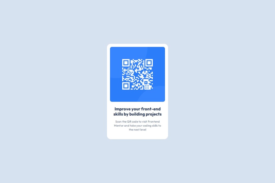
Desktop design screenshot for the QR code component coding challenge

This is a solution for...

  • HTML
  • CSS
1newbie
View challenge

Design comparison


SolutionDesign

Solution retrospective


What are you most proud of, and what would you do differently next time?

Setting and understanding custom properties is what I am most proud of about this little project.

I struggled at first when translating the data from the figma design to code as I needed some time to familiarize myself with Figma.

What challenges did you encounter, and how did you overcome them?

How to best structure the CSS style in one page.

What specific areas of your project would you like help with?

I would like to know if the structure of the CSS style follow best practices. Although I do not know if it is relevant since it is really a small project.

Community feedback

P

@Islandstone89

Posted

Hi, well done!

Some of the things I like about your solution:

  • Including a proper CSS Reset
  • Use of Custom Properties for colors, typography and spacing
  • Font sizes in rem instead of px, which is vital for accessibility.

All of these are things that 90% of people miss out on, so great work!

A few suggestions:

HTML:

  • I would wrap the card in a <div class="card"> inside of <main>. The <main> holds all of the main content on a page. Since a card is rarely the only component on a page, it makes sense to have it in its own <div>.

  • The alt text must also say where it leads(the frontendmentor website). A good alt text would be "QR code leading to the Frontend Mentor website."

  • I would change the heading to a <h2> - a page should only have one <h1>, reserved for the main heading. As this is a card heading, it would likely not be the main heading on a page with several components.

CSS:

  • I would add 1rem of padding on the body, to ensure the card doesn't touch the edges on small screens.

  • Remove height: 100% on html, body, and instead use min-height: 100svh on the body.

  • Instead of setting a fixed width, we want the card to grow and shrink according to the viewport. However, we do want to limit the width of the card, so it doesn't get too wide on larger screens. To solve these issues, change width to max-width: 20rem.

  • letter-spacing should not be in px. You can use em, where 1em equals the element's font size.

  • Instead of writing .card .text, I would just write .text ,as the former creates more specificity than needed.

Kepp up the good work :)

Marked as helpful

0
MikDra1 6,090

@MikDra1

Posted

I see in your code that sometimes you have sth like this: 0.9375rem;

I encourage you to set a font-size on html to 62.5%. Then one rem is equal 10px. After this your calculations would be easier because you would know that one 1rem = 10px

html {
font-size: 62.5% // It means that 1rem = 10px. From this it is easier to use rem
}

p {
font-size: 1.6rem; // Here this paragraph font-size will be 16px;
}

Hope you found this comment helpful 💗💗💗

Good job and keep going 😁😊😉

0

Please log in to post a comment

Log in with GitHub
Discord logo

Join our Discord community

Join thousands of Frontend Mentor community members taking the challenges, sharing resources, helping each other, and chatting about all things front-end!

Join our Discord