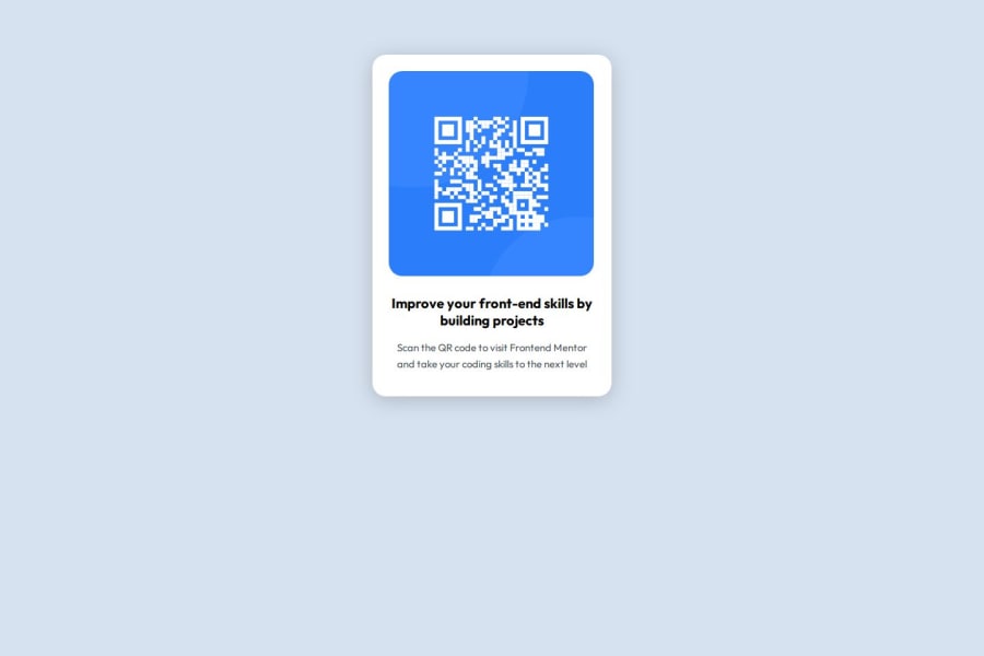
Design comparison
Solution retrospective
I most proud of how I was able to get a better understanding of media queries since I have never used them before. I hope to have more practice using them.
What challenges did you encounter, and how did you overcome them?I struggled with centering the QR code inside of the container. I had to play with padding and width to really get it to how I wanted it to look.
What specific areas of your project would you like help with?Simpler ways to center divs within a container. It took a lot more trial and error to figure out how to get the qr code image within the container perfectly centered and I'm sure there are easier ways to get that accomplished.
Community feedback
- @SvitlanaSuslenkovaPosted 2 months ago
body { display: flex; flex-direction: column; justify-content: center; align-items: center; min-height: 100vh; } Try this to align(top-bottom) and justify(left-right) your project to the center. It applies to the parent component(body), don't forget about !!min-height!!. You can use grid instead of flex too.
To center you can use 1. flex 2. grid 3.parent element-padding+child element width:100%. Depends on situation.
Marked as helpful0@sc0006Posted 2 months ago@SvitlanaSuslenkova I knew there would be a way to do it using flexbox. Just tried it and so much easier and required a lot less effort. Cool know i can use flex, grid or that third suggestion you gave. I will have to try that one as well! Quick question. Im still brand new and haven't learned vh yet. What is the purpose/use of that element. Thank you again so much for your input as well!
0 - @grace-snowPosted about 2 months ago
Hi, I have some more tips for you...
- the image doesn't need wrapping in an extra div. Keep the html simple whenever you can.
- watch the capitalisation in alt text just as with any other written content. It's QR code not qr code.
- this is a single card component. When we build components in isolation like this we still need to consider how they would be used when dropped into a real website later. This card would never be used to serve the main heading on a page, so it shouldn't include a h1. Use a lower importance heading level like h2 instead.
- get into the habit of including a full modern css reset at the start of the styles. That's not what you have at the moment. Look them up. Andy Bell or Josh Comeau both have good ones you can look up and use.
- I strongly recommend against resizing the html font size like you are doing. That's a very very old hack that is not considered necessary or recommended these days. More information: https://fedmentor.dev/posts/rem-html-font-size-hack/
- this card is overflowing my screen because you've given it a fixed width. Don't do that. It means components can't be fluid and respond to the available space. Instead, use max-width on the card (still in rem). That allows it to go narrower when it needs to (like on my phone screen!)
- the image must not have an explicit width either. All it needs in this is what's already included in any modern css reset : max-width 100% and display block. You can optionally give the image an aspect ratio of 1 as that will slightly improve browser performance because the browser will know to save a square ratio of space while the image loads in).
- you don't need any media query in this challenge.
- to prevent the card component from being able to touch screen edges, give the body a little padding in this challenge. This can be in px.
1 - @StroudyPosted 2 months ago
Awesome job tackling this challenge! You’re doing amazing, and I wanted to share a couple of suggestions that might help refine your approach…
-
Setting the
width
andheight
for an<img>
helps the page load faster and prevents content from jumping around as the image loads. This is good for performance and improves user experience. However, if your image needs to keep a consistent shape (aspect ratio) across different screen sizes, it's better to use the CSSaspect-ratio
property instead. -
For future project, You could downloading and host your own fonts using
@font-face
improves website performance by reducing external requests, provides more control over font usage, ensures consistency across browsers, enhances offline availability, and avoids potential issues if third-party font services become unavailable. Place to get .woff2 fonts -
I think you can benefit from using a naming convention like BEM (Block, Element, Modifier) is beneficial because it makes your CSS more organized, readable, and easier to maintain. BEM helps you clearly understand the purpose of each class, avoid naming conflicts, and create reusable components, leading to a more scalable codebase. For more details BEM,
You’re doing fantastic! I hope these tips help you as you continue your coding journey. Stay curious and keep experimenting—every challenge is an opportunity to learn. Have fun, and keep coding with confidence! 🌟
1@sc0006Posted 2 months ago@Stroudy Thank you for helpful reply. I will remember to set the width and height of <img> for future reference. Im still a newbie and have never used aspect-ratio so I guess I have some later research to do there. I just looked up BEM naming and I definitely can see how that can make things more readable as well as useful. Will look to try and start doing that practice if it can help make my code more readable. Thanks again!
1 -
Please log in to post a comment
Log in with GitHubJoin our Discord community
Join thousands of Frontend Mentor community members taking the challenges, sharing resources, helping each other, and chatting about all things front-end!
Join our Discord