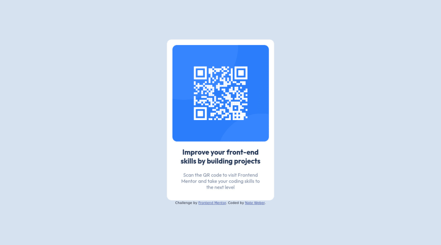
Design comparison
Solution retrospective
When building websites, would you recommend building them mobile first, or desktop first?
Follow up question: Is there any particular reason to build them mobile / desktop first, then adapt the code for the other sizes?
Community feedback
- @juancaorgPosted about 2 years ago
Hi Nathan 👋!
Answering your questions, based on my experience:
It depends, but if you are building a website for a general audience (i.e. everyone), I would recommend almost every time building mobile first.
Some reasons:
- It's easier to build. You may have learned to build a website based on the desktop design, but if you pay attention, desktop designs are generally more complex layouts. Mobile are, most of the time, a single column and are less complex because of their width constrains.
- Most users use mobile. Plain simple, if you're building for everyone, most of your traffic is going to be mobile.
- Space. Similar to the first reason. It's easier to expand your layout when you have built mobile first, instead of the other way around and finding out that you may have ran out of space on your viewport, or that you'll have to remove some elements instead of adding elements, which in my opinion, is easier.
Nevertheless, these reasons are mostly opinions based on my experience. I would recommend you to read more about Mobile first on this MDN article.
Have a good one, and keep going! 🙌
Marked as helpful1 - @miranleginPosted about 2 years ago
Hi Nathan,
regarding question about building websites i would say that in my experience it all comes down to what are you building. For example, if you are working on this project it really isn't important because it looks the same on all resolutions and orientations. Only the side padding on the body is getting smaller or larger depending on viewport. My personal preference is building with least amount of code and minimum overrides and that is sometimes mobile first and other times desktop first approach. I try to keep styles that are uniformed across the width of the browser as a base and only use media queries when there is need to add additional styling.
Hope that makes sense.
Keep coding! Cheers!
0 - @AdrianoEscarabotePosted about 2 years ago
Hi Nathan Weber, how are you?
I really liked the result of your project, but I have some tips that I think you will like:
1- Document should have one main landmark, you could have put all the content inside the
main
tag click here2- Page should contain a level-one heading, you could have replaced
p.improv
withh1
click hereThe rest is great!! Hope it helps... 👍
0
Please log in to post a comment
Log in with GitHubJoin our Discord community
Join thousands of Frontend Mentor community members taking the challenges, sharing resources, helping each other, and chatting about all things front-end!
Join our Discord