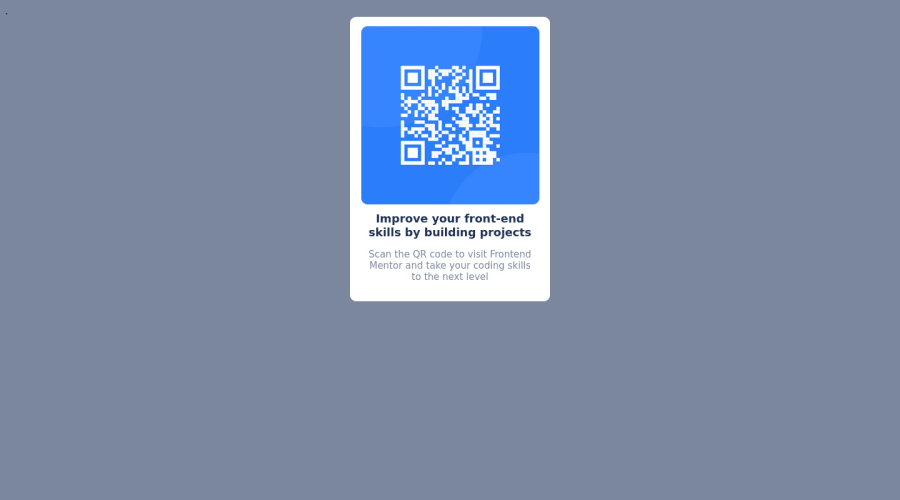
Design comparison
Solution retrospective
I find it difficult sometimes to know where to start, I'm still quite new with coding and applying what I've learned so far.
What really helped for me is to find a coding buddy, I've learned tonnes of new concepts while working through Live Stream on VS
Community feedback
- @correlucasPosted about 2 years ago
👾Hi @Anne301, congratulations on your solution!👋 Welcome to the Frontend Mentor Coding Community!
Great solution and a great start! From what I saw you’re on the right track. I’ve few suggestions for you that you can consider adding to your code:
1.When you download the project files there’s a file called
style-guide.md
where you can find information such ashsl color codes
and thefont-size
for the headings. The background-color in this case isbackground-color: #D5E1EF
2.Fix the alignment of the whole content using
flex
andmin-height
to manage the vertical alignment and make everything centered.First of all putmin-height: 100vh
to thebody
to make the body display 100% of the viewport height (this makes the container align to the height size that's now 100% of the screen height) size anddisplay: flex
eflex-direction: column
to align the child element (the container) vertically using the body as reference.3.Clean your code by removing some unnecessary divs, most of the content can stand alone without a div. Use div only for blocks that need a special alignment or the content needs a special positioning.
4.Add a margin of around
margin: 20px
to avoid the card touching the screen edges while it scales down.5.Use relative units as
rem
orem
instead ofpx
to improve your performance by resizing fonts between different screens and devices. These units are better to make your website more accessible. REM does not just apply to font size, but to all sizes as well.body { min-height: 100vh; font-family: 'Outfit', sans-serif; background-color: var(--Grayish-blue); display: flex; align-items: center; justify-content: center; flex-direction: column; }
Here's my solution for this challenge if you wants to see how I build it: https://www.frontendmentor.io/solutions/qr-code-component-vanilla-cs-js-darklight-mode-nS2aOYYsJR
✌️ I hope this helps you and happy coding!
0 - @ron-wollschlaegerPosted about 2 years ago
Hi Anne, you are looking for a coding buddy? I can help you with that. I am a beginner myself who works as a graphic designer and wants to shift to frontend development. Not only that, but I also like UI and UX Design, which I want to improve to while studying frontend related languages. I don't know if Backend is something for me, but that's a story for another day.
I have met some new friends in this community and want to make a small but like-minded group to grow and to help each other. We are currently three and right now start our first personal project together while trying to solve every challenge on this website here.
If this is something you would like, tell me more about you and your plans on Discord or Slack. (Discord: pxMahio 🍉 #8485)
Have a nice day! 😁
0@Anne301Posted about 2 years agoHowdy! :)
Couldn't find you on Discord! My server is: ratchet301#8511
Let's chat about coding :D
0@ron-wollschlaegerPosted about 2 years ago@Anne301 Would be awesome! :D I have sent you a friend request.
0 - @denieldenPosted about 2 years ago
Hello Anne, You have done a good work! 😁
Some little tips to improve your code:
<title>Frontend Mentor | QR code component</title>
go inside thehead
not into the body- add
main
tag and wrap the card for improve the Accessibility - remove all
margin
fromcontainer
class - use flexbox to the body to center the card. Read here -> best flex guide
- after, add
min-height: 100vh
to body because Flexbox aligns child items to the size of the parent container - instead of using
px
use relative units of measurement likerem
-> read here
Keep learning how to code with your amazing solutions to challenges.
Hope this help 😉 and Happy coding!
0 - @ShayokhShorfuddinPosted about 2 years ago
Hey there Anne! I hope you are having a great day! I have some design suggestion for your UI to make it perfect!
- Adding some spacing between elements would make the UI more lively and fresh!
- Apply "Outfit" font from Google Fonts to all the texts.
- Make sure the component is at the center of the screen.
- At last, the background color should be hsl(220, 15%, 55%);
All the best!
0
Please log in to post a comment
Log in with GitHubJoin our Discord community
Join thousands of Frontend Mentor community members taking the challenges, sharing resources, helping each other, and chatting about all things front-end!
Join our Discord