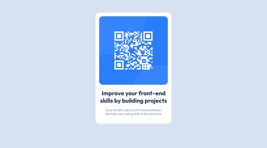
Design comparison
Community feedback
- @0xabdulkhaliqPosted almost 2 years ago
Hello there 👋. Congratulations on successfully completing the challenge! 🎉
- I have other recommendations regarding your code that I believe will be of great interest to you.
QR iMAGE ALT TEXT 📸:
- Since this component involves scanning the QR code, the image is not a decoration, so it must have an
altattribute.
- The
altattribute should explain the purpose of theimage.
- E.g.
alt="QR code to frontendmentor.io"
<img src="/images/image-qr-code.png" alt="QR code to frontendmentor.io">
.
I hope you find this helpful 😄 Above all, the solution you submitted is great !
Happy coding!
Marked as helpful0 - @Kamlesh0007Posted almost 2 years ago
Congratulations on completing the challenge! That's a great achievement, and I'm sure you put a lot of effort into it. I really liked the way you approached the challenge and the code you wrote. You demonstrated a good understanding of the concepts and applied them effectively to solve the problem.I have a few suggestions to improve your code further. you need to make the container center properly use min-height:100vh not 90vh and also remove the default margin of body tag min-height:100vh is used to ensure that a container or element takes up at least the full height of the viewport (the visible area of the browser window) regardless of the content inside it.
body {
background-color: var(--gray);
display: flex;
justify-content: center;
align-items: center;
height: 100vh; // add this
margin: 0; // add this
}
Marked as helpful0
Please log in to post a comment
Log in with GitHubJoin our Discord community
Join thousands of Frontend Mentor community members taking the challenges, sharing resources, helping each other, and chatting about all things front-end!
Join our Discord
