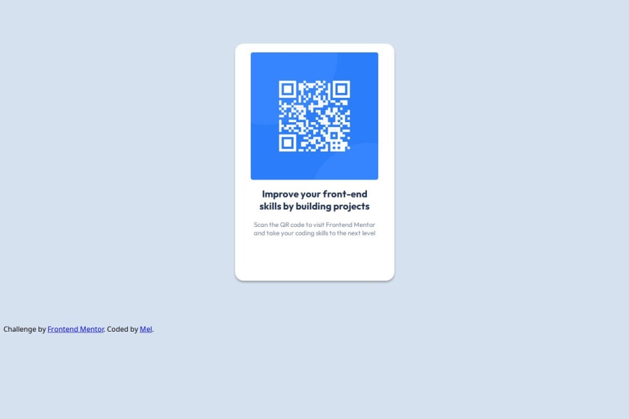
Design comparison
Solution retrospective
This is my first time building something that I'm getting other people to look at. So that is a big step for me.
What challenges did you encounter, and how did you overcome them?I am not quite sure that I actually did this correctly as I'm also a first time user of Figma so I didn't know if I was using it right. I'm sure I will be told
Community feedback
- @StroudyPosted about 2 months ago
Well done on getting this far! You’re clearly putting in the effort, and it shows. Just a few things I noticed that could enhance your solution…
-
Having a sufficient contrast ratio between foreground (like text specifically your
<p>
) and background colors is essential for readability, especially for people with visual impairments. It ensures that content is accessible to everyone, improves user experience, and helps meet accessibility standards, which is important for inclusive web design. -
This does not matter that much at this stage but something to be mindful of for SEO(Search Engine Optimisation),
<meta>
description tag missing. -
Using a
<main>
tag inside the<body>
of your HTML is a best practice because it clearly identifies the main content of your page. This helps with accessibility and improves how search engines understand your content. -
Using
max-width: 100%
ormin-width: 100%
is more responsive than justwidth: 100%
because they allow elements to adjust better to different screen sizes. To learn more, check out this article: responsive-meaning. -
Developers should avoid using pixels (
px
) because they are a fixed size and don't scale well on different devices. Instead, userem
orem
, which are relative units that adjust based on user settings, making your design more flexible, responsive, and accessible. For more information check out this, Why font-size must NEVER be in pixels or this video by Kevin Powell CSS em and rem explained. -
Another great resource for px to rem converter.
-
Having a clear and descriptive
alt
text for images is important because it helps people who use screen readers understand the content, making your site more accessible. It also improves SEO, as search engines usealt
text to understand the image's context, helping your site rank better, Check this out Write helpful Alt Text to describe images, -
Using a full modern CSS reset is beneficial because it removes default browser styling, creating a consistent starting point for your design across all browsers. It helps avoid unexpected layout issues and makes your styles more predictable, ensuring a uniform appearance on different devices and platforms,
-
Using
rem
orem
units in@media
queries is better thanpx
because they are relative units that adapt to user settings, like their preferred font size. This makes your design more responsive and accessible, ensuring it looks good on different devices and respects user preferences. -
Using
margin-inline: auto
is better thanmargin: auto
for centering elements horizontally because it is more precise. To center an element, set its width and applymargin-inline: auto
; this will center it within its container., You can center the height by using this code snippet
You’re doing fantastic! I hope these tips help you as you continue your coding journey. Stay curious and keep experimenting—every challenge is an opportunity to learn. Have fun, and keep coding with confidence! 🌟
Marked as helpful2 -
- @TedJenklerPosted about 2 months ago
Hi @seekingcat,
Nice project! Here are a few suggestions:
I noticed that there are too many containers (i.e., <div> elements). To simplify your layout, you can make the <body> a flex container with align-items: center and justify-content: center. Use one main card with flex-direction: column to stack all content without unnecessary nesting. This approach will greatly improve your SEO and accessibility, and also make your code more readable and maintainable, especially for larger projects. Additionally, you can use the <footer> element for the Frontend Mentor footer.
Another cool way to center a <div> is by setting position: relative on the parent, position: absolute on the content, with top: 50%, left: 50%, and transform: translate(-50%, -50%). While Grid is also an option, it can be more complex. For this project, using Flexbox is the recommended approach.
Keep up the great work!
Best, Teodor
1
Please log in to post a comment
Log in with GitHubJoin our Discord community
Join thousands of Frontend Mentor community members taking the challenges, sharing resources, helping each other, and chatting about all things front-end!
Join our Discord