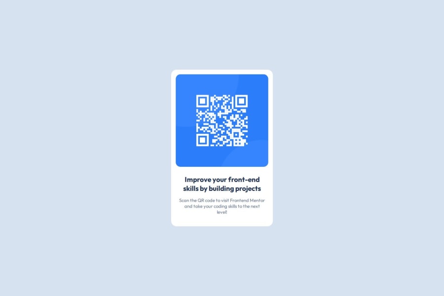
Design comparison
SolutionDesign
Community feedback
- P@ashea29Posted 8 months ago
Great job on getting it so close to the design! A couple suggestions to improve accessibility: (1) using semantic HTML instead of divs, where possible; (2) since the h2 is the only heading tag it would be best just to make it an h1, because skipping heading levels is a don't-do in WCAG.
Marked as helpful1
Please log in to post a comment
Log in with GitHubJoin our Discord community
Join thousands of Frontend Mentor community members taking the challenges, sharing resources, helping each other, and chatting about all things front-end!
Join our Discord
