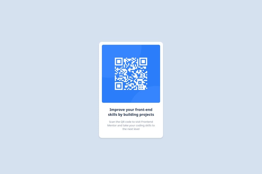
Design comparison
Solution retrospective
What I'm most proud of in this project is how effectively I applied Flexbox to center the QR code component and create a clean, responsive design. It was rewarding to see the layout adapt smoothly across different screen sizes while maintaining its visual integrity. If I were to approach this challenge again, I would focus more on improving accessibility, such as implementing ARIA labels and ensuring a better color contrast ratio for users with visual impairments. I would also explore using CSS Grid to see how it compares with Flexbox in terms of layout flexibility and responsiveness.
What challenges did you encounter, and how did you overcome them?One of the main challenges I encountered was getting the QR code component perfectly centered on the page across different screen sizes. Initially, the layout would shift slightly depending on the viewport dimensions, causing it to look unbalanced, especially on mobile devices. To overcome this, I applied Flexbox to the container and used justify-content and align-items properties to center the content both vertically and horizontally. I also added min-height: 100vh to ensure the container took up the full height of the viewport, which resolved the issue of shifting content. Another challenge was maintaining a clean, minimal design while ensuring readability and good contrast between text and background colors. I tweaked the font size and color choices, referring to accessibility guidelines, until I found a balance that worked well for both design and usability.
What specific areas of your project would you like help with?I would like help with the following specific areas of my project: Accessibility Enhancements: I want to improve the accessibility of the project, such as implementing ARIA roles and ensuring the color contrast ratios are optimal for all users, especially those with visual impairments. Responsive Design: While the layout works well on most devices, I'd appreciate guidance on refining the mobile responsiveness, particularly on very small screens, to make sure the design scales perfectly. Code Optimization: I’d like feedback on how I can refactor my CSS to be more efficient and maintainable. Specifically, I’m curious if there are better ways to handle layout and spacing across different screen sizes without duplicating code. Design Consistency: Suggestions on improving the visual design of the QR code component, particularly balancing the whitespace, would be helpful. I’m aiming for a clean, modern look, but I feel it could be refined further.
Any tips or resources on these aspects would be greatly appreciated!
Community feedback
- @lazydroidePosted about 1 month ago
Hi Prime127, i'm going to try to review your challenge although I don't think I have knowledge enough to advise anybody XD. Improving accessibility: Instead use "divs" use semantic html (main, article, section, etc). A good way to make the CSS code more efficient and maintainable is using variables especially in more complex projects. Also putting your CSS code in a separate file would be useful. And finally the dimensions are a little off, didn't you use the figma file with the design information? Also you used Arial instead Outfit typography. Reviewing your project make me realize how many things I have done wrong in mine. Best regards.
Marked as helpful0
Please log in to post a comment
Log in with GitHubJoin our Discord community
Join thousands of Frontend Mentor community members taking the challenges, sharing resources, helping each other, and chatting about all things front-end!
Join our Discord
