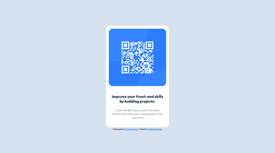
Design comparison
Solution retrospective
so all in all seemed was fairly simple project. i'm not sure what i was supposed to do with the desktop and mobile pages. i just did the desktop page. i think a few ways that i fixed text into position was a bit long winded but for my first attempt i'm pretty happy.
Community feedback
- @vanzasetiaPosted over 2 years ago
Hello, Gsteele! 👋
Congratulations on completing your first Frontend Mentor challenge! 🎉 Good effort on this challenge! Nice alternative text for the QR code! 👏
There are some areas that you could improve.
- I would recommend not setting any
width
to thebody
element. It causes a lot of issues like in this case, it creates horizontal rule on devices that are below 1440px width and on screen that is larger than 1440px, it makes the card aligned to the left, it would never be on the center of the page. - There's no need to use
strong
tag inside the heading. It already gets emphasized by the heading tag. - I notice an inline styling which I would recommend moving into
styles.css
. It's a good practice to keep the HTML and the CSS separated. Inline styling has the highest specificity or priority which can be a disaster in large projects.
That's it! Happy coding! 😁
Marked as helpful1 - I would recommend not setting any
- @TechNechPosted over 2 years ago
Hey, nice work you have done on this challenge. The problem is that QRcomponent isn't aligned in the center. I would suggest you added the following style to your
body
in CSS which will fix that issue.display: flex; justify-content: center; align-items: center; height: 100vh;
Also try working on your fonts, e.g: weight, size, family.
Marked as helpful0@WildSpaceCadetPosted over 2 years ago@TechNech thanks very much. by the time i started studying typeography in the course i think i was pretty wiped out last night... it showed when it came to working with fonts. the flex display is something that i havent looked at yet. i was working with the (very limited) knowledge and elements from the course i am taking. but this is how i learn new elements i guess :D
0
Please log in to post a comment
Log in with GitHubJoin our Discord community
Join thousands of Frontend Mentor community members taking the challenges, sharing resources, helping each other, and chatting about all things front-end!
Join our Discord