

Design comparison

Solution retrospective
It was pretty easy.
Community feedback
- @PhoenixDev22Posted over 2 years ago
Hello Luciano Fittipaldi,
Congratulation on completing this frontend mentor challenge. Your solution looks great. I see you have received some incredible feedback . I have some suggestions regarding your solution if you don't mind:
-
You should use
<main>landmark for the card . HTML5 landmark elements are used to improve navigation experience on your site for users of assistive technology.` -
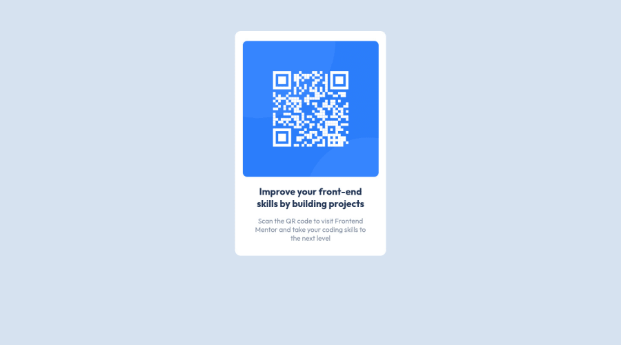
The alternate text should indicate where the Qr code navigate the user :
like Qr code to frontend mentor.
- General point: Consider using rem and em units as they are flexible, specially for font size better to use rem. If your web content font sizes are set in absolute units, such as pixels, the user will not be able to re-size the text or control the font size based on their needs. Relative units “stretch” according to the screen size and/or user’s preferred font size, and work on a large range of devices.
Aside from these , Great job on this one.
Marked as helpful1 -
- @correlucasPosted over 2 years ago
👾Hello Luciano, congratulations for your new solution!
Your component is perfect, but you've missed the alignment to the screen center, remember ever that the child elements align to its parents, in this case is the
body. Here is what you need to do to fix the alignment, see the code below:body { background-color: hsl(212, 45%, 89%); min-height: 100vh; display: flex; align-items: center; justify-content: center; }Hope it helps Luciano, and keep it up!
Marked as helpful1


Please log in to post a comment
Log in with GitHubJoin our Discord community
Join thousands of Frontend Mentor community members taking the challenges, sharing resources, helping each other, and chatting about all things front-end!
Join our Discord