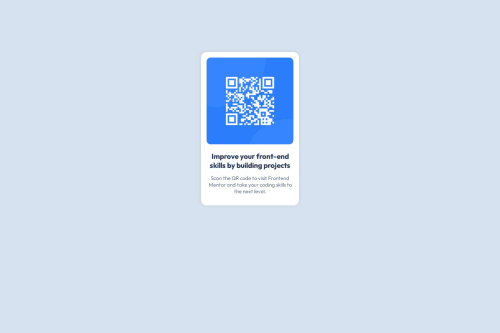
Submitted over 1 year agoA solution to the QR code component challenge
QR Code scanning card using flexbox
@Edgerunners-2077

Solution retrospective
What are you most proud of, and what would you do differently next time?
i am not very proud of it, as for the things I did differently, box-shadow, border-radius, flexbox.
What challenges did you encounter, and how did you overcome them?Alignment using flex box, centering a div. Used mostly Google and a little bit Chat-GPT for overcoming these callenges
What specific areas of your project would you like help with?I would to get help with making cleaner code, using flexbox, responsiveness, and other things you think could be better.
Code
Loading...
Please log in to post a comment
Log in with GitHubCommunity feedback
No feedback yet. Be the first to give feedback on Edgerunners-2077's solution.
Join our Discord community
Join thousands of Frontend Mentor community members taking the challenges, sharing resources, helping each other, and chatting about all things front-end!
Join our Discord