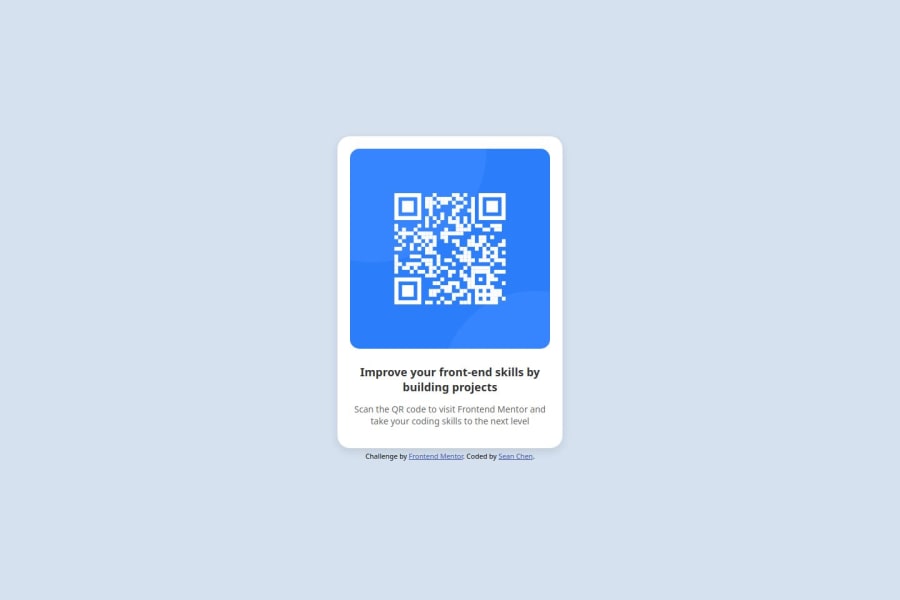
Design comparison
Solution retrospective
Submitting my first solution on Frontendmentor. I am hoping to improve my skills in creating CSS from scratch as it has been a while.
What challenges did you encounter, and how did you overcome them?Creating CSS from scratch is one of the biggest challenge I have encountered. I did use ChatGPT to help with some CSS stuff but did some modifications to fulfill the challenge.
What specific areas of your project would you like help with?Writing effective CSS from scratch.
Community feedback
- @gmagnenatPosted 3 months ago
Hi, here are a few pointers to help you improve this solution.
- You need a <main> landmark to indicate the main content of your page
- use min-height on your body instead of fixed height so it can scale with the content when needed
- use max-width in rem on your card so it can also scale with the content if the default browser font size is increased by the user.
- use a modern css reset at the beginning of your css to deal with browsers default styles and spacing
- don't use pixel for anything related to fonts Why font-size must NEVER be in pixels
- Try to add classes to your different element for styling and focus on lower specificity. Instead of
.card h1
use.card-heading
it will help keep a more maintainable code base. For example if tomorrow you change that h1 to and h2, the class stays the same and you don't have to go change your CSS.
I hope you find something usefull here to improve your solution. Don't hesitate to ask if you need more details.
Happy coding !
Marked as helpful1@grace-snowPosted 3 months agoThis is all great feedback from @gmagnenat ! 👆Make sure you go through each item carefully and apply them before moving on. This is being cut off on my screen at the moment because of some of these mistakes and they will become amplified as you progress onto more complex challenges if you don't get into good habits and fix stuff now.
I’ll only add a little more:
- make sure you link the font family as defined in the style guide. Link the family and weights you need in the html head, then apply those font styles in the css.
- as this is a single component demo, and only a card, it would not have a h1. Part of the challenge of building with a component mindset is thinking about the context of where that component would be used in a real site. This component wouldn't act as a heading for a whole page, so instead of a h1 use a h2.
- use the colors given to you in the style guide.
- in my opinion the alt description on the image needs to be more descriptive. Imagine if there was more than one card used on a page - it's no good if their alt text is all the same. This image alt should say what the image is (QR code) and where it goes (to FrontEndMentor.io).
0 - @BeatrizPoncesIPPosted 3 months ago
Change the
font-family
to "Outfit" and set theh1
to "bold". I believe that, besides that, the only difference between the sites is theattribution
that you included, which caused the structure of the objects to change their height to be centered. If you really want to practice and remember CSS, don't use ChatGPT, otherwise you won't remember anything the next day.Marked as helpful0
Please log in to post a comment
Log in with GitHubJoin our Discord community
Join thousands of Frontend Mentor community members taking the challenges, sharing resources, helping each other, and chatting about all things front-end!
Join our Discord