Design comparison
Solution retrospective
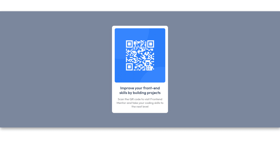
This is my first project, how did I do?
Community feedback
- @visualdennissPosted over 1 year ago
You have done great! It looks very nice on a desktop view.
My suggestion would be add min-height of 100vh (making this equal to full viewport height) instead of using 600px height for the container and remove the margin from it. This way you can get rid of the extra white space you have around the page. E.g.:
.container { display: flex; width: 1440px; background-color: hsl(220, 15%, 55%); box-shadow: 2px 7px 15px rgb(163 163 163); justify-content: center; align-items: center; min-height: 100vh; }
Keep up the good work and good luck on your journey.
Hope this feedback was helpful!
1@ChimataraPosted over 1 year ago@visualdenniss Thank you so much for the feedback, I'll implement it ASAP.
0
Please log in to post a comment
Log in with GitHubJoin our Discord community
Join thousands of Frontend Mentor community members taking the challenges, sharing resources, helping each other, and chatting about all things front-end!
Join our Discord
