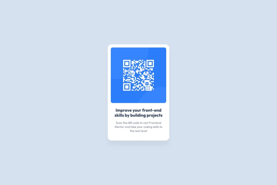
Design comparison
Community feedback
- @eduardolluisPosted 5 months ago
Hey there! The current design is almost stop on :), the overall structure is well organized and there are hardly any noticeable differences. However, it could enhance it by adjusting the border-radius of the image to match the main container .qr-code.
Additionally, it would be beneficial to ensure consistency in font sizes and colors throughout the design for better readability and visual harmony. Consider refining the <h1> color to ensure it stands out effectively, and reviewing the <p> text size to optimize readability, especially on different devices. These adjustments will not only improve legibility but also enhance the overall visual appeal and user experience.
0
Please log in to post a comment
Log in with GitHubJoin our Discord community
Join thousands of Frontend Mentor community members taking the challenges, sharing resources, helping each other, and chatting about all things front-end!
Join our Discord
