Design comparison
Solution retrospective
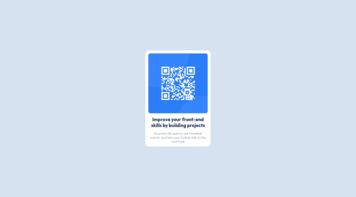
there isnt any thing heavy about this basic project all u have to is design a card component by using grid layout ->by making the ```css .grid1x2 { display: grid; grid-template-rows: 63% 37%;//the distribution of row percentage between image and lower part// grid-template-columns: 22rem;//horizontal width of card//
background: var(--color-background);
border-radius: 15px; overflow: hidden;}
Community feedback
- @hyrongennikePosted about 2 years ago
Hi @yishak621,
Nice job on completing the challenge
The card seems a bit small you can make the following changes.
.grid1x2 { display: grid; grid-template-rows: 60% 40%; background: var(--color-background); max-width: 300px; /* height: 35rem; */ border-radius: 15px; overflow: hidden; /* transform: scale(1.1); */ }
remove the
height
and thetransform
from your rule and set the width tomax-width: 300px
. Also remove the the following..grid1x2 { transform: scale(0.8); }
Hope this is helpful.
Marked as helpful1@yishak621Posted about 2 years ago@hyrongennike sure thank you i can make a transform to scale 1.2 or something like that
0 - @correlucasPosted about 2 years ago
👾Hi @yishak621, congrats on completing this challenge!
I've just opened your live site and I can say that you did a great job putting everything together! There's some tips to improve your solution:
Use
<main>
instead of<div>
to wrap the card container, its better to use<main>
in this case because you’re indicating that’s the main block of content of this page and also because<div>
doesn’t have any meaning, it's just a block element.The html structure is fine and works, but you can reduce at least 20% of your code cleaning the unnecessary elements, you start cleaning it by removing some unnecessary
<div>
. For this solution you wrap everything inside a single block of content using<div>
or<main>
(better option for accessibility) and put inside the whole content<img>
/<h1>
and<p>
.<body> <main> <img src="./images/image-qr-code.png" alt="Qr Code Image" > <h1>Improve your front-end skills by building projects</h1> <p>Scan the QR code to visit Frontend Mentor and take your coding skills to the next level</p> </main> </body>
✌️ I hope this helps you and happy coding!
0@yishak621Posted about 2 years ago@correlucas thanks again bro i use div as a main container to wrap everythig together inside it but if it is unnecessary i will remove it ..
0
Please log in to post a comment
Log in with GitHubJoin our Discord community
Join thousands of Frontend Mentor community members taking the challenges, sharing resources, helping each other, and chatting about all things front-end!
Join our Discord