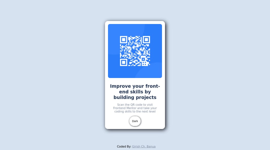
Design comparison
Community feedback
- @correlucasPosted about 2 years ago
👾Hello @Girishbanua, Congratulations on completing this challenge!
Great code and great solution! I’ve few suggestions for you that you can consider adding to your code:
Your solution is great and the code is working, but the HTML structure can be reduced by removing unnecessary divs, all you need is a single
<main>or<div>to keep all the content inside, and nothing more. The ideal structure is thedivand only the image, heading, and paragraph.Here’s one example to show can be cleaner this HTML structure:
<body>
<main>
<img src="./images/image-qr-code.png" alt="QR Code Frontend Mentor" >
 <h1>Improve your front-end skills by building projects</h1>
<p>Scan the QR code to visit Frontend Mentor and take your coding skills to the next level</p>
</main>
</body>
To reduce the CSS you can use the direct selector for each element instead of using
classthis way you have a code even cleaner, for example, you can select everything using the direct selector for (img, h1, and p, main).✌️ I hope this helps you and happy coding!
Marked as helpful0 - @VCaramesPosted about 2 years ago
Hey @Girishbanua, some suggestions to improve you code:
- To give you HTML code structure, you want to set up your code in the following manner (only did parent containers):
 <body>
      <main>
        <article class="card-container"></article>
      </main>
      <footer class="attribution"></footer>
  </body>
The Main Element identifies the main content of the document.
While the Article Element will serve as the card’s container, because the card represents a complete, or self-contained, section of content that is, in principle, independently reusable.
More info:
https://web.dev/learn/html/headings-and-sections/
-
The Alt Tag description for the QR image needs to be improved upon. Its needs to tell screen reader users what it is and where it will take them to when they scan it.
-
The Picture Element is not needed for this challenge since you are not changing between images.
-
It is better to keep you HTML and CSS code in separate files in order to keep your codes clean and easier to update in a future time.
Happy Coding! 👻🎃
Marked as helpful0 - @GirishbanuaPosted almost 2 years ago
Just modified some css stylings and added a button at the bottom of the card to change the theme. Also added some css animations to make it look satisfying. This was a very basic one but while improving it I learnt a lot of things, inclding javascript
0
Please log in to post a comment
Log in with GitHubJoin our Discord community
Join thousands of Frontend Mentor community members taking the challenges, sharing resources, helping each other, and chatting about all things front-end!
Join our Discord
