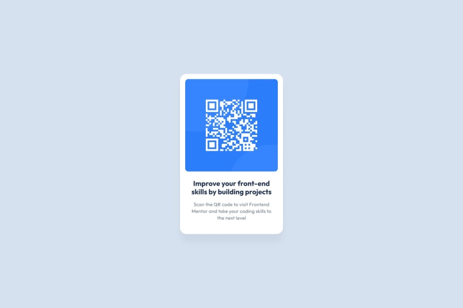
Design comparison
Solution retrospective
All feedbacks are welcome
Community feedback
- @BrianJ-27Posted over 2 years ago
Great Job overall.
I checked out your code and visually it looks good. If you want more specific feedback, I like to try to match the design even down to how many lines of content are there. In your solution, there are 2 lines for your content and the design shows it breaks to a third line. I would maybe increase your font-size a bit or put a little padding on each side of your p tags.
Also to fix your accessibility issue:
- change your div tag to a main tag (or main landmark)
- change your h3 to an h1 (each page should have at only 1 h1 tag per page)
This should clear up your accessibility flags but overall nice job and happy coding!
0 - @shashreesamuelPosted over 2 years ago
Good job John
Keep up the good work
Your solution looks great however I think that the card description is supposed to wrap after the word "Frontend" , secondly the box-shadow needs to be subtle.
Lets talk about your accessibility issues, all are a direct result of your first issue which states that the document must have a main landmark, this means that there is no identification of the main content of your document hence by wrapping all the tags within the body element between the semantic main tags it then establishes the document's main content thus resolving the issue.
I recommend reading about semantic tags here to avoid these accessibility issues.
I hope this helps
Cheers
0
Please log in to post a comment
Log in with GitHubJoin our Discord community
Join thousands of Frontend Mentor community members taking the challenges, sharing resources, helping each other, and chatting about all things front-end!
Join our Discord
