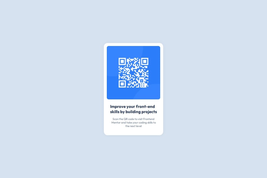
Design comparison
SolutionDesign
Community feedback
- @vb8146649Posted 3 months ago
!!!This isn't properly structured.!!!
- use landmark tag such as
main,footer,header. i.e the card should be inside a main . - dont use
brunnecessarily , like you did in both heading and p . Make it flow naturally . - use
h2or lower heading since when integrating this component this wont be the main heading of a page , hence it should be h2 or lower. - use
text-align:centerin heading also . - I see the problem , you used
width:fit-contentin styling the body of the component thats why you have usedbrtag to mitigate the disaster . Its a bad practice dont use it like this. instead use amax-widthstyling that should be in rem or em , using px or vh or vw is never generally recommended . - No need to use
flexsince the tags are block and all will be displayed one after another. Usingflexunnecessarily can only lead to disaster . - Accessibility : the image tag should have a well defined description , not like
alt="image"when the image is important like a qr.
0 - use landmark tag such as
Please log in to post a comment
Log in with GitHubJoin our Discord community
Join thousands of Frontend Mentor community members taking the challenges, sharing resources, helping each other, and chatting about all things front-end!
Join our Discord
