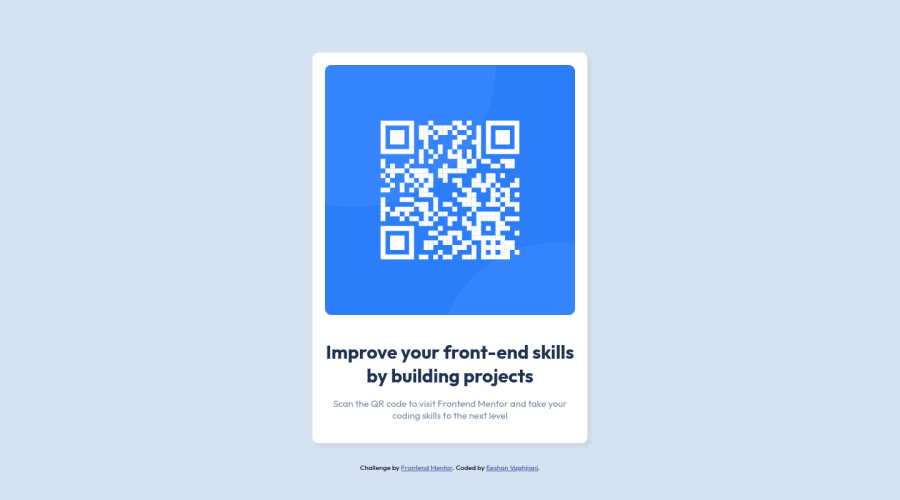
Design comparison
SolutionDesign
Community feedback
- @romila2003Posted about 2 years ago
Hi Eeshan,
Welcome to the frontend mentor community and congratulations for 🎉 for completing your first challenge, the card looks great, and it is great that you used the flex property to center the card. I found some issues I want to address:
- It is best practice to wrap the main content within the
maintag which would ensure that your content is wrapped within the correct landmarks e.g.<main class="container"></main> - You should also wrap the footer within the
footertag and nest this within the body but outside of the main content e.g.<footer class="attribution"></footer> - This challenge does not require you to make responsive changes therefore there would be no need to use media queries. Also, the width of your card is quite long so I would recommend you reduce the width to look something like this:
.container {
  max-width: 300px;
  width: 100%;
}
Since your card has a lot of padding, the width of the card will actually be
340pxinstead.Overall, great attempt and wish you the best for your future projects so keep coding 👍.
0 - It is best practice to wrap the main content within the
Please log in to post a comment
Log in with GitHubJoin our Discord community
Join thousands of Frontend Mentor community members taking the challenges, sharing resources, helping each other, and chatting about all things front-end!
Join our Discord
