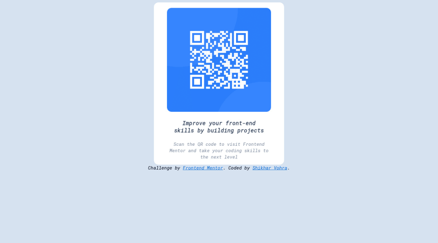
QR Code Responsive Website Challenge using HTML, CSS and Flexbox
Design comparison
Solution retrospective
- I have not understood how to prevent the main container from resizing, as I resize the browser
- How must I use the given desktop and mobile widths in my solution, because I have not used it anywhere.
Community feedback
- @MartineauRemiPosted almost 3 years ago
Hey !
-
You gave the width property a value of "30%" on your container. This means that the container will take 30% of the viewport, and this is the reason it is resizing along with the browser. If you want the width to stay the same no matter the size of the viewport, you could give it a fixed value (e.g. width: 340px;)
-
The given desktop and mobile widths are just indications on how the design should look like on those 2 particular values. If you open your dev tools tab in your favorite browser, you can actually target those particular widths and get a better idea on how your design should look like.
Hope this can help you ! Keep up the good work, and happy coding :)
Marked as helpful1 -
- @mahnoork18Posted almost 3 years ago
Hey, nice work there! I would like you to suggest a few things: Try to wrap in the <main> tag to make it more structured, also you should keep your content part in a single div it will help you manage it well. For the responsive part, I would like to suggest you add a (max-width-768px) media query to take care of the mobile and tablet versions. also, add max-width to the container for mobile design. Hope this helps.
Marked as helpful1
Please log in to post a comment
Log in with GitHubJoin our Discord community
Join thousands of Frontend Mentor community members taking the challenges, sharing resources, helping each other, and chatting about all things front-end!
Join our Discord
