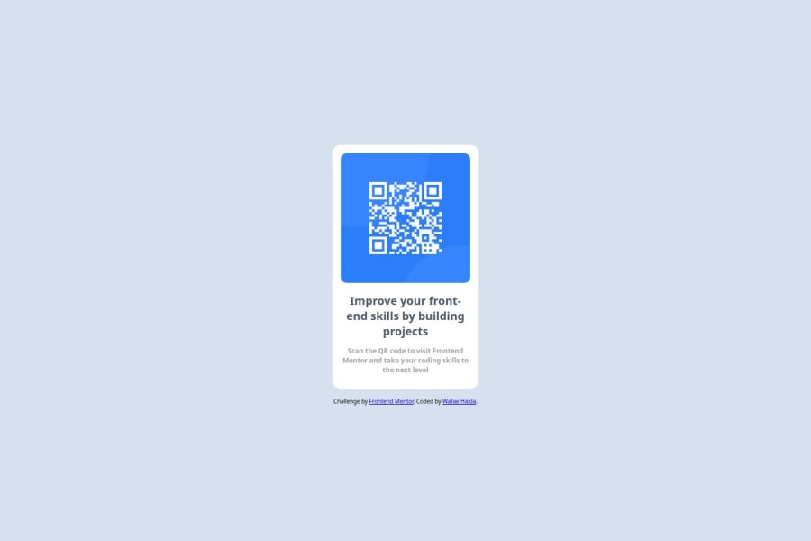


Design comparison

Solution retrospective
I learned how to use HTML5 for semantic markup, CSS for styling, and Flexbox for creating responsive layouts. I also explored the box-sizing: border-box; property to ensure consistent element sizing and the importance of media queries for a mobile-first workflow. Additionally, I've effectively integrated these concepts to create a well-structured, responsive webpage.
Some HTML code I'm proud of
proud of this css
{
  display: flex;
  justify-content: center;
  align-items: center;
  flex-direction: column;
  height: 100vh;
  gap: 15px;
  box-sizing: border-box;
  padding: 15px;
  max-width: 230px;
  text-align: center;
  font-family: 'Roboto', Arial, sans-serif;
}
One of the challenges I encountered was making the design responsive. Initially, I struggled to achieve this using only CSS and HTML. However, I overcame this by learning and applying various CSS techniques, such as Flexbox and Mobile-first workflow. These strategies allowed me to create a layout that adapts smoothly to different screen sizes. This experience taught me the importance of responsive design in ensuring accessibility and usability across all devices.
Community feedback
Please log in to post a comment
Log in with GitHub
Join our Discord community
Join thousands of Frontend Mentor community members taking the challenges, sharing resources, helping each other, and chatting about all things front-end!
Join our Discord