Design comparison
Solution retrospective
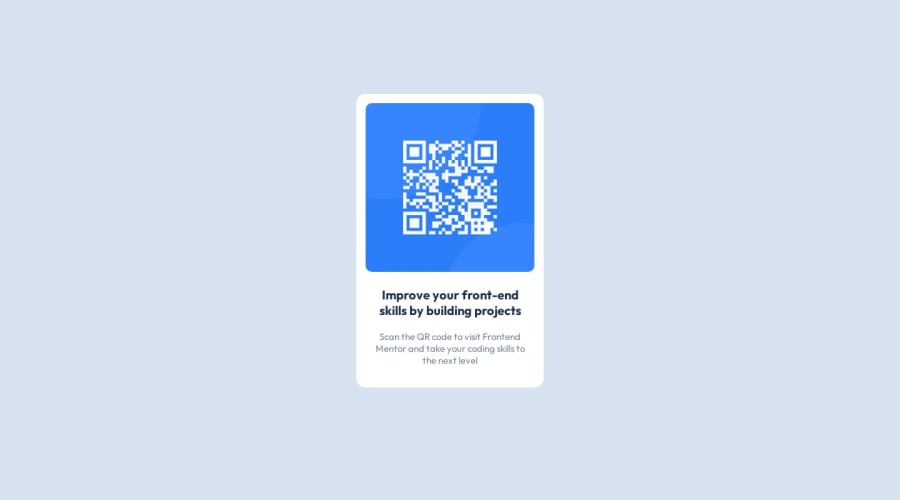
Hello World ! I make this only with block and css margin and padding so it's not really responsive so if someone want to help me to improve the code feel free :)
Community feedback
- @0xabdulkhaliqPosted over 1 year ago
Hello there π. Congratulations on successfully completing the challenge! π
- I have other recommendations regarding your code that I believe will be of great interest to you.
CSS π¨:
- Looks like the component has not been centered properly. So let me explain, How you can easily center the component without using
margin
orpadding
.
- We don't need to use
margin
andpadding
to center the component both horizontally & vertically. Because usingmargin
orpadding
will not dynamical centers our component at all states
- To properly center the component in the page, you should use
Flexbox
orGrid
layout. You can read more about centering in CSS here π.
- For this demonstration we use css
Grid
to center the component.
body { min-height: 100vh; display: grid; place-items: center; }
- Now remove these styles, after removing you can able to see the changes
#all { margin: auto; margin-top: 150px; }
- Now your component has been properly centered
.
I hope you find this helpful π Above all, the solution you submitted is great !
Happy coding!
0@Barenko91Posted over 1 year ago@0xAbdulKhalid Thanks Abdul for the feedback i will use more the grid and flexbox the for the next project ! but i have a question what is the size in vh ?
0@0xabdulkhaliqPosted over 1 year ago@Barenko91
You can read more about the
vh
like relative units hereGlad you found this feedback helpful ! π€
0 - @HassiaiPosted over 1 year ago
Replace <div id="all"> with the main tag, <div class="f-para"> with <h1> and <div class="s-para"> with <p> to make the content/page accessible. click here for more on web-accessibility and semantic html
Add the alt attribute
alt=" "
to the img tag and give it a value. The value of the alt attribute is the description of the image. For decorative images like icons, there is no need to give it an alt value, for more on alt attribute Click here.Every html must have <h1> to make it accessible. Always begin the heading of the html with <h1> tag wrap the sub-heading of <h1> in <h2> tag, wrap the sub-heading of <h2> in <h3> this continues until <h6>, never skip a level of a heading.
For a responsive content,
- Replace the width in #all with max-width, increase its value and the height with a padding value for all the sides
max-width: 320px which is 20rem/em padding:16px which is 1rem/em
- Give the img a max-width of 100% and a border-radius value, the rest are not needed.
Give h1 and p text-align: center, the same margin-left, margin-right and margin-top values. Give p a margin bottom value.
To center #all on the page using flexbox or grid instead of margin,
- USING FLEXBOX: add min-height:100vh; display: flex; align-items: center: justify-content: center; to the body
body{ min-height: 100vh; display: flex; align-items: center; justify-content: center; }
- USING GRID: add min-height:100vh; display: grid place-items: center to the body
body{ min-height: 100vh; display: grid; place-items: center; }
Use relative units like rem or em as unit for the padding, margin, width values and preferably rem for the font-size values, instead of using px which is an absolute unit. For more on CSS units Click here and here
Hope am helpful.
Well done for completing this challenge. HAPPY CODING
0@Barenko91Posted over 1 year ago@Hassiai Thanks hassiai for the feeback i will work on my html semantic!
0 - Replace the width in #all with max-width, increase its value and the height with a padding value for all the sides
- @RabberpoliPosted over 1 year ago
Hi! Well done completing this challenge! As you said, you used only margin and padding properties. This lets you achieve a pretty good result but it doesnβt guarantee a responsive behavior. A powerful property that can ease your job in term of responsiveness is flexbox (you can give a look at the documentation here). This property along with
justify-content
andalign-items
let you center automatically your DOM object without struggling with margins and paddings.Hope to be helpful, keep going and happy coding!
0@Barenko91Posted over 1 year ago@Rabberpoli Thanks Giovanni for the feedback i will work on my use of flexbox and grid on css i see it's a basic!
0
Please log in to post a comment
Log in with GitHubJoin our Discord community
Join thousands of Frontend Mentor community members taking the challenges, sharing resources, helping each other, and chatting about all things front-end!
Join our Discord