

Design comparison
SolutionDesign

Solution retrospective
What are you most proud of, and what would you do differently next time?
its pretty basic
What challenges did you encounter, and how did you overcome them?none
What specific areas of your project would you like help with?shadows
Community feedback
- @gmagnenatPosted 3 months ago
Hi, congrats on completing the challenge!
There is a lot to learn from this one, even if it "seems" pretty basic.
Does the solution include semantic HTML?
- Everything should be contained in landmarks. You need a
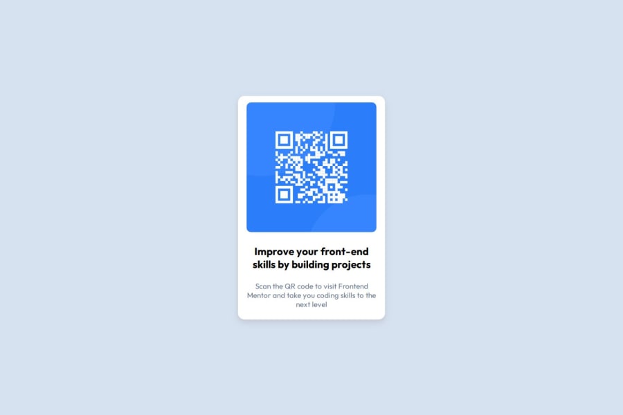
<main>element to wrap the main content of your page. - You need to describe the image a bit more in the alt of the QR code. QR codes are understood by assistive technology, so it can be simply adding the link where it goes to.
Is it accessible, and what improvements could be made?
- There are accessibility issues.
- Currently, it fails a reflow test, so it will provide a very bad user experience for users who need to zoom the content or increase the system default font size.
- Use a min-height of 100vh on your body so it can scale if the content takes more space.
- Don't use fixed width on elements that contain text in general. As font size can be increased, the content needs to be able to scale. Use max-width in relative units
rem. - You shouldn't use pixels for anything related to fonts. Check this great resource: Why font-size must NEVER be in pixels.
Does the layout look good on a range of screen sizes?
- A small horizontal padding can be added on the body so when it's on a small screen the card doesn't touch the edge of the screen.
Is the code well-structured, readable, and reusable?
- You should add a modern CSS reset in all your projects at the top of your stylesheet. Check out Josh Comeau or Andy Bell; they both have modern CSS resets that are pretty good.
- It would be more maintainable if you use classes to target your elements instead of targeting the HTML element directly. For example, if you update your code and decide to use an h1 instead of the h2 you are using now, you will have to go update your CSS too.
- The repository file organization is a mess. There are different directories inside. No
README.mdat the root of the folder. The project is nested inside a folder. Your files should be at the root of your repository, not in a folder.
Does the solution differ considerably from the design?
- It respects the design intention and looks close to the design.
I hope this list helps you improve this solution and your other challenges. Let me know if you need more details on one of the points.
Happy coding !
Marked as helpful0 - Everything should be contained in landmarks. You need a


Please log in to post a comment
Log in with GitHubJoin our Discord community
Join thousands of Frontend Mentor community members taking the challenges, sharing resources, helping each other, and chatting about all things front-end!
Join our Discord