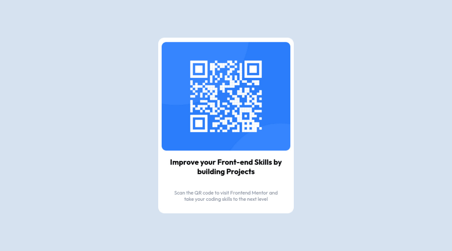
Design comparison
Community feedback
- @TanDevvPosted about 2 years ago
Hi, Hyckael! Great work on this one! Let's talk about a few things in the accessibility report. :)
📝HTML:
- Page should contain a level-one heading
Every site must have a
h1where it may make sense, (eg: a title) to describe the main content of your page. This provides vital navigational assistance for users that use assistive systems for impairment, helping them easily find the main content they want to get to.If sometimes your page may not have something you think deems as a h1, we can use what is called visually-hidden by hiding it from visual users but will still be called out by a screen-reader for visually impaired users.
(For more information on this, you can read this article by Webaim)
- Heading levels should only increase by one
Ensure all your headings
<h1>to<h6>are in a logical order. Try to always start from<h1>, followed by<h2>and so on.This is good practice for not only general organization of your page but importantly for users of screen reading software as they may want to jump from different headings to quickly determine the content of the page.
Not doing so may create confusion, as the user navigating this way may be left wondering where the missing heading is!
(For more information regarding Headings and how to write them, you can read this article also by MDN)
🎨 CSS:
width= 100%on yourbodyis not needed as it is a family of block elements, (such ashtml,divandp) it will automatically have a width of 100% as it takes the length of the page.
@media (max-width:562px) { .container{ height: 80%; } .card{ width: 60%; } .qrContainer{ height: 60%; } } @media (max-width:562px) { .container{ height: 70%; } .card{ width: 70%; } }- I noticed in the following you have two duplicates, consider removing one of them and merging the two of them all in just one @media query to avoid any possible problems later on.
I hope you find this information helpful. Above all, your solution is great, well done! 😄
0 - @Finney06Posted about 2 years ago
Hello there 👋. Good job on completing the challenge !
Here is a suggestion regarding your code that may be of interest to you.
HTML 🏷️:
To clear the Accessibility report:
- Always avoid skipping heading levels; Starting with
<h1>and working your way down the heading levels (<h2>,<h3>, etc.) helps ensure that your document has a clear and consistent hierarchy.
I hope you find it helpful!😏 Above all, the solution you submitted is 👌. 🎉Happy coding!
0 - Always avoid skipping heading levels; Starting with
Please log in to post a comment
Log in with GitHubJoin our Discord community
Join thousands of Frontend Mentor community members taking the challenges, sharing resources, helping each other, and chatting about all things front-end!
Join our Discord
