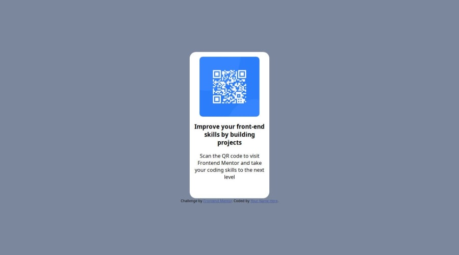
Design comparison
SolutionDesign
Solution retrospective
What are you most proud of, and what would you do differently next time?
That I understood very well. What I think comes to reality
Community feedback
- @fauzihizPosted 11 months ago
while your solution look differ than design, actually your main element qr code positioning are better, i even use media queries while turn out i dont need it. before im having a hard time and wondering why i cant centered it properly.
Marked as helpful1@JacobMayor007Posted 10 months ago@fauzihiz Thankk yoouu, I hope all your projects will prosper. <3 <3 <3
1
Please log in to post a comment
Log in with GitHubJoin our Discord community
Join thousands of Frontend Mentor community members taking the challenges, sharing resources, helping each other, and chatting about all things front-end!
Join our Discord
