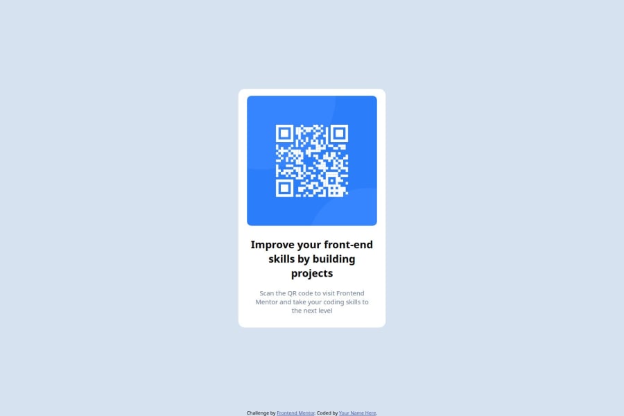


Design comparison

Solution retrospective
I am proud that it looks very similar to the original solution.
What challenges did you encounter, and how did you overcome them?It was the first small project I did without tutorials and copying code from tutorials, so I had to figure out the flexbox, essentially what's the parent what's the child, etc. to make sure the container is centered.
Community feedback
- @Mayen007Posted 4 months ago
Hey @ShadowCoder040! Your project turned out great, especially for your first small project—awesome work! 🎉
That said, there’s an opportunity to improve responsiveness for smaller screens. I noticed your container width is set to 340px, which means it won’t adjust properly for screens narrower than that. A more flexible approach would be to combine a default width with a max-width defined as a percentage of the parent container. This allows your design to adapt more smoothly to varying screen sizes.
Here’s an example you could try:
.container {
  width: 90%; /* Default width relative to the viewport or parent */
  max-width: 340px; /* Prevents the container from growing too large */
  margin: 0 auto; /* Centers the container */
}
This technique ensures the container fits smaller screens while maintaining a consistent maximum size for larger displays.
By implementing these tweaks, your layout will look great on a wider range of devices. Keep up the amazing work, ShadowCoder! 🚀
Marked as helpful0

Please log in to post a comment
Log in with GitHub
Join our Discord community
Join thousands of Frontend Mentor community members taking the challenges, sharing resources, helping each other, and chatting about all things front-end!
Join our Discord