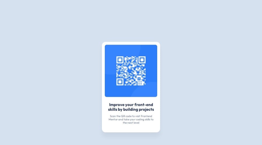
QR Code Project using Visual Studio Code, Figma, and Chrome Dev Tools
Design comparison
Solution retrospective
I'm just happy to get started on this platform. I am proud of finally using Figma for something, I don't use designing or wireframe tools as much as I should so hopefully, I'll get some good practice here.
What challenges did you encounter, and how did you overcome them?It wasn't that challenging for me, I've been messing around with code, IDEs, and Git/GitHub for a while now so I'm used to the tools.
What specific areas of your project would you like help with?I use Chrome Dev Tools to try to design better webpages for RWD but sometimes the screen doesn't adjust for mobile phone screens, like it's lagging, and even when I refresh the page it still doesn't adjust the layout. Does anyone else run into this issue?
Community feedback
- @Alex-Archer-IPosted 4 months ago
Hi!
Well, I can't be sure what exactly happened on your screen, but as I can see your card doesn't adjust to various screens cos you hardcoded
width
of thebody
tag. The initial width of this tag is equal to the screen size so it's better not to overwrite it.As for height of the body use
min-height: 100vh
. This way it'll take all screen's height and could stretch if the content will be larger.And another couple suggestions:
- It's better to use
rem
values for font sizes. It's a special values which depends of the browser font settings and provide better user experience and responsiveness. - Every page should contains
main
tag. - You can skip the
div
wrapper for the image and style it directly.
Hope it could helps =)
Congrats with your first challenge here, good luck =)
Marked as helpful1@End-Us3rPosted 4 months ago@Alex-Archer-I Thanks for the suggestions. I mainly followed the Figma design that was provided by them for the laptop and mobile phone screen sizes. I wasn't quite sure what they wanted so I just blindly followed them. They used variables for their CSS design and I hadn't come across it before so I decided to try it out. I see what you mean by adjusting the screen for RWD though, I'll probably design it later to better fit my style and for better RWD.
1@Alex-Archer-IPosted 4 months ago@End-Us3r
I see, but Figma templates can't provide variants for every screen size cos there are tons of them. So you can consider templates as some kind of... thresholders by which you can check different appearances. But you doesn't have to hardcore those measures.
As for variables - it's cool that you use them =) You can convert
px
intorem
though. In most browsers1rem = 16px
.Marked as helpful1@End-Us3rPosted 4 months ago@Alex-Archer-I Thanks for letting me know how it works up here. I figured this be a good place to practice without having to come up with ideas myself.
1@Alex-Archer-IPosted 4 months ago@End-Us3r
Yeah, same. I'm here because I tired to make up challenges by myself (especially the design part) =)
You're welcome, glad I could help. Feel free to ask anything if need =)
1@End-Us3rPosted 4 months ago@Alex-Archer-I I believe I fixed the RWD, it should work better when adjusting screen sizes. I'm going to move to the next challenge, I plan on completing it later today.
1@Alex-Archer-IPosted 4 months ago@End-Us3r
I see that you changed width and height of body. Good =)
You can omit
width: 100vw
at all, by the by. It is a default value. And you can get rid of the matching properties insidemedia
query - they still be applied.And as for
height
forbody
I suggest you to usemin-height
property.Anyway, cool, keep doing =)
0 - It's better to use
Please log in to post a comment
Log in with GitHubJoin our Discord community
Join thousands of Frontend Mentor community members taking the challenges, sharing resources, helping each other, and chatting about all things front-end!
Join our Discord