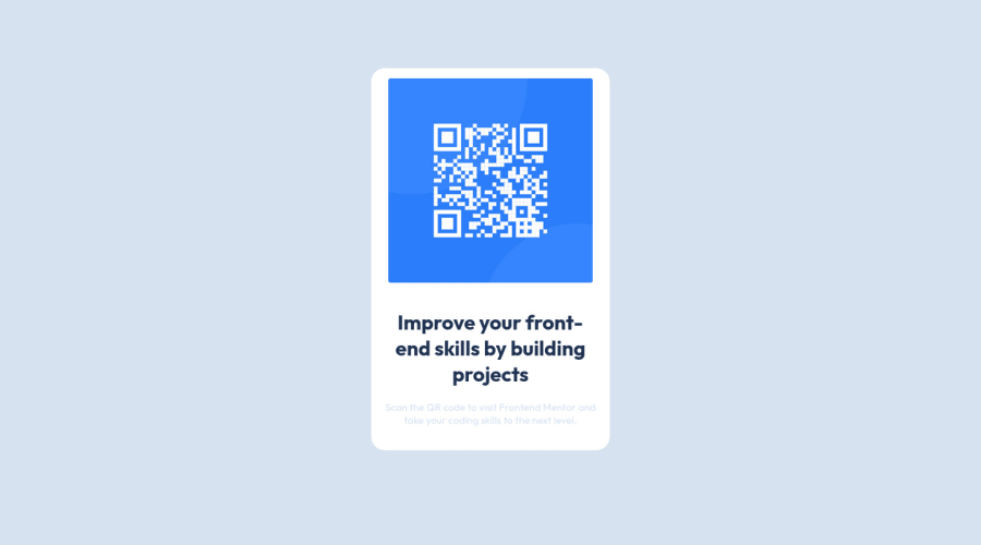
Design comparison
Solution retrospective
I found the project not so hard to work on. I was unsure on how to center the qr code but i somehow managed to do it.
Community feedback
- @correlucasPosted about 2 years ago
πΎHi @Carolkiarie, congratulations on your solution!π Welcome to the Frontend Mentor Coding Community!
Great solution and a great start! From what I saw youβre on the right track. Iβve few suggestions for you that you can consider adding to your code:
1.Use
<main>
instead of<div>
to wrap the card container. This way you show that this is the main block of content and also replace the div with a semantic tag.2.Add the website favicon inserting the svg image inside the
<head>
.<link rel="icon" type="image/x-icon" href="./images/favicon-32x32.png">
3.To maintain the card responsive use
max-width
instead ofwidth
this way you allow the content to be flexible. The difference betweenmax-width
andwidth
is thatwidth
is fixed andmax-width
has a maximum size but can shrink to fit the content.4.Use relative units like
rem or em
instead ofpx
to have a better performance when your page content resizes on different screens and devices.REM
andEM
does not just apply to font size, but all sizes as well. To save your time you can code your whole page usingpx
and then in the end use a VsCode plugin calledpx to rem
to do the automatic conversion or use this website https://pixelsconverter.com/px-to-remHere's my solution for this challenge if you wants to see how I build it: https://www.frontendmentor.io/solutions/qr-code-component-vanilla-cs-js-darklight-mode-nS2aOYYsJR
βοΈ I hope this helps you and happy coding!
Marked as helpful2@CarolkiariePosted about 2 years ago@correlucas Thank you so much for the feedback. Quick question kindly. in the style sheet guide, there are values given for the widths of the mobile and the desktop (- Mobile: 375px
- Desktop: 1440px) . Where exactly do you use them and what was the need of them being included in the stylesheet. Thank you for your time!
0 - @AdrianoEscarabotePosted about 2 years ago
Hi Caroline, how are you?
I really liked the result of your project, but I have some tips that I think you will like:
1- Every page should have one main landmark
<main>
. So replace the div that wraps the whole content with<main>
to improve accessibility. click herePrefer to use
rem
overpx
to have your page working better across browsers and resizing the elements properlyThe rest is great!!
Hope it helps...π
Marked as helpful0 - @ABQ4539Posted about 2 years ago
Great work @Carolkiarie
- From what I see, the border radius on the image is not enough
img {border-radius: 10px;}
- Also as I learnt recently, it is better to implement CSS variables to make your CSS code more organized. It will look like this:
:root { --primary-color: value; --secondary-color: value; --tertiary-color: value; }
- And it will be used as this:
h1 { color: var(--secondary-color); }
You can learn more about CSS variables here
0@CarolkiariePosted about 2 years ago@ABQ4539 Thank you for the reply. I am quite new to Css variables and it kind of gets me confused. I will however dive into the link you have attached to see if i will have a better understanding.
0 - From what I see, the border radius on the image is not enough
Please log in to post a comment
Log in with GitHubJoin our Discord community
Join thousands of Frontend Mentor community members taking the challenges, sharing resources, helping each other, and chatting about all things front-end!
Join our Discord