

Design comparison

Solution retrospective
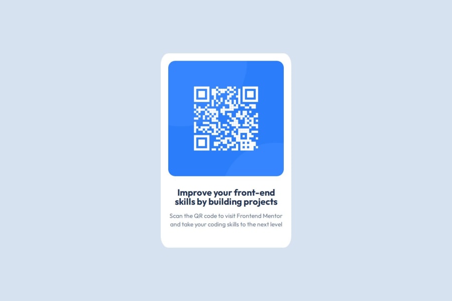
Using flex box as a beginner to centre the content and arrange the image/text in a column.
What challenges did you encounter, and how did you overcome them?Positioning the card central vertically was challenging, however once I had set a min-width on the property, it worked.
What specific areas of your project would you like help with?I would like help on making this more responsive, including through the use of units (such as svh and rem which I have read about online) and also making the structure of the card stay in place, even on small mobile display sizes.
Community feedback
- @grace-snowPosted about 2 months ago
Hi, great job on this overall!
The HTML on this looks pretty good, but there are a few improvements to make mainly in CSS. I'll try to go through one by one...
- Make sure the image alt description is descriptive. This component would very likely be used multiple times on a page, and the alt can't be the same on every card image. So update it to include that this is the QR Code for FrontEndMentor.io.
- always include a full modern CSS reset at the start of the styles in every project you do. Andy Bell or Josh Comeau both have good ones you can look up and use.
- don't use percentage for border radius. It's making the radius really strange at the moment because the component is rectangular not square, so the radius on one side of the corner is much shallow than the other side. Use fixed values for border radius.
- I don't think you mean to be using
emunits the way you are at the moment. Ems should only be used in rare and specific circumstances where you want the value of a property to specifically scale with the font size. For the padding and margin on the card I don't actually think you want a relative unit at all. At the moment this card has the potential to go extremely narrow if a user changes their default text size setting in browser or device. I would use pixels for these properties, or possibly amin()CSS function for the margin likemargin: min(16px, 6vw); - there's no real reason to be making the card a flex column, unless you meant to use the gap property to create vertical spacing instead of margin on the child elements... Block elements stack vertically by default.
- it certainly not wrong to use
emunits for line height but it is unusual. Usually height is unitless like 1.5. I think the main reason that became such a convention is just because the CSS ends up shorter and big project any byte you can save becomes worth it.
Marked as helpful0@marcus-hillPosted about 2 months agoHi @grace-snow,
Thanks for taking the time to provide this feedback, it has been very insightful and allowed me to make some effective changes to the code.
I have modified the units used for the border, padding and line height which should now prevent the page becoming extremely narrow in certain situations. I have also removed two flexboxes from the page, realising they were completely unnecessary given the block level display of the elements.
Thank you.
0 - @Playerrl-uxPosted about 2 months ago
Nice bro, I could not finish the chalenge without using media queries. I dont knew the "rem" and "em" you are using to the text, that is a good learning.
0


Please log in to post a comment
Log in with GitHubJoin our Discord community
Join thousands of Frontend Mentor community members taking the challenges, sharing resources, helping each other, and chatting about all things front-end!
Join our Discord