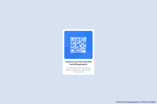
Design comparison
Solution retrospective
to center the elements of the page
What specific areas of your project would you like help with?my margins and my paddings
Community feedback
- @krushnasinnarkarPosted 4 months ago
Hi @CAF2801,
Congratulations on successfully completing the challenge!
Your solution looks great, but I have a few suggestions that might help improve it:
-
QR Image Visibility: It seems the QR image isn't visible because the image file wasn’t uploaded to your repository. Please upload the image file and update the
src
attribute of theimg
tag accordingly. -
Dimensions: Avoid using fixed units like
px
for width and height. Instead, use relative units such as100%
for width and100vh
for height to make your design more responsive. -
Centering the Component: The current method of using
margin
to center.main-content
isn’t ideal. For perfect centering, use Flexbox. You can achieve this by adding the following styles to#container
:display: flex; align-items: center; justify-content: center; height: 100vh;
This will center
.main-content
both vertically and horizontally.If you're not familiar with Flexbox, you can learn more here:
I hope you find these suggestions helpful.
Feel free to reach out if you have more questions or need further assistance.
Happy coding!
Marked as helpful0@CAF2801Posted 4 months agoThank you so much for the feedback. I'll check the links you gave me for sure ! @krushnasinnarkar
0 -
Please log in to post a comment
Log in with GitHubJoin our Discord community
Join thousands of Frontend Mentor community members taking the challenges, sharing resources, helping each other, and chatting about all things front-end!
Join our Discord