Design comparison
SolutionDesign
Solution retrospective
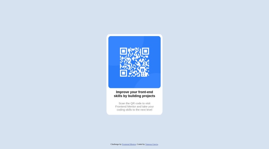
With HTML and CSS, I have had a difficult time with the layout and ensuring things are aligned. The majority of this project was me attempting to fix my Footer because I had focused too much on one specific element versus multiple elements like the body and main. What are some good resources for helping out with CSS alignments? Thank you!
Community feedback
- @sharathrudhuPosted 4 months ago
Review Resources:
- Check the Figma design files to understand the layout and visual elements.
- Read the
styleguide.md
for specific design guidelines and styles.
Layout Design:
- Experiment with layout techniques such as Flexbox or Grid to align with the design specifications.
- Implement the layout as per the guidelines in the Figma design file.
Footer Element:
- Note that the footer is an optional component based on the design.
- If implementing the footer takes additional time, prioritize the main design elements first.
Code Cleanliness:
- Refer to the provided resources to develop cleaner and more maintainable code.
- Ensure the code aligns with the design and style guide for a polished final product.
Marked as helpful0
Please log in to post a comment
Log in with GitHubJoin our Discord community
Join thousands of Frontend Mentor community members taking the challenges, sharing resources, helping each other, and chatting about all things front-end!
Join our Discord