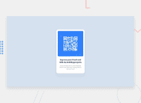
Design comparison
SolutionDesign
Community feedback
- @NaveenGumastePosted over 2 years ago
hay! T2001Kaye Nice work
Marked as helpful1 - @denieldenPosted over 2 years ago
Hi 2001Kaye, great job! Congratulations on completing the challenge.
I had a look at your solution and I have a few suggestions for you:
- The
maintag not need attributerolebecause is semantic tag
Centering a
divwithabsolutepositioning is now deprecated, it uses modern css likeflexbox or grid:- try to use flexbox to the body for center the card. Read here -> flex guide
- also set
heigthof body to100vhbecause Flexbox aligns to the size of the parent container.
Overall you did well :)
Hope this help and happy coding!
Marked as helpful1 - The
Please log in to post a comment
Log in with GitHubJoin our Discord community
Join thousands of Frontend Mentor community members taking the challenges, sharing resources, helping each other, and chatting about all things front-end!
Join our Discord

