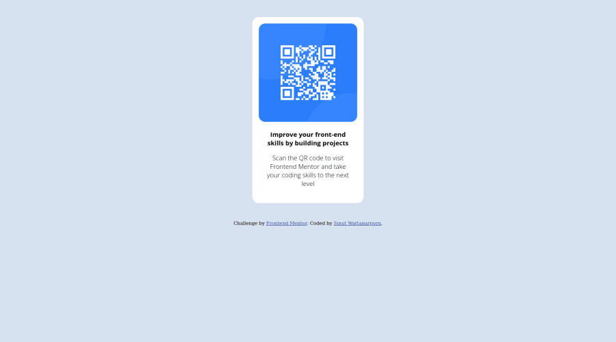
QR code page with pure HTML and CSS as a beginner
Design comparison
Solution retrospective
I know that I can't make the page be the same as original design page. I would to ask you that "As a beginner can anyone suggest and hint me how to do this projcet or just learn from solutions?"
Community feedback
- @NaveenGumastePosted over 2 years ago
Hello SINUT WATTANRPORN ! Congo 👏 on completing this challenge
Let's look at some of your issues, shall we:
- To center the card vertically 👇
display:flex; align-items: center; justify-content: center; width: 100%; min-height: 100vh- Warp your card content around the main tag Ex: 👇
<body>
<main class="container">
*all you content here*
</main>
</body>
happy Coding😀
Marked as helpful1 - @PhoenixDev22Posted over 2 years ago
Greeting @Blue-Cheesecake ,
I have few suggestions regarding your solution:
-
There should be two landmark components as children of the body element - a
main(which will be the component ) and afooter(which will be the attribution).<Footer>should not be in the<main >. HTML5 landmark elements are used to improve navigation . -
Page should contain a level-one heading . you can use
<h1>withclass="sr-only"(Hidden visually, but present for assistive tech). -
To center the card on the middle of the page , you can use the flexbox properties and
min-height: 100vhfor the<body>like this:
body{ display:flex; align-items: center; justify-content: center; width: 100%; min-height: 100vh-
height: 435px;It's rarely ever a good practice to set heights on elements,you almost never want to set it . let the content define the height . -
width: 260px;an explicit width is not a good way . consider usingmax-widthto card instead. That will let it shrink a little when it needs to -
You should use
emandremunits .Bothemandremare flexible, Usingpxwon't allow the user to control the font size based on their needs. -
It's recommended not to use
pxfor font-size. you can use rem instead . General point: better not to style on ID'S , the better way is a single class.
Overall , your solution is good. Hopefully this feedback helps.
Marked as helpful1 -
- @denieldenPosted over 2 years ago
Hi Sinut, I took some time to look at your solution and you did a great job!
Also I have some tips for improving your code:
- add
maintag and wrap the card for Accessibility - To make it look as close to the design as possible adjust the size of the title and text
- remove all
marginfrom.outer-containerclass - try to use flexbox to the body for center the card. Read here -> best flex guide
- after add
min-heigth: 100vhto body because Flexbox aligns to the size of the parent container - instead of using
pxtry to use relative units of measurement -> read here
Overall you did well :)
Hope this help and happy coding!
Marked as helpful1 - add
Please log in to post a comment
Log in with GitHubJoin our Discord community
Join thousands of Frontend Mentor community members taking the challenges, sharing resources, helping each other, and chatting about all things front-end!
Join our Discord
