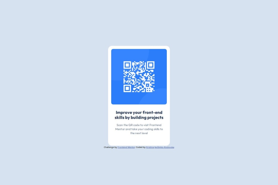


Design comparison

Community feedback
- @StroudyPosted about 2 months ago
Amazing job with this! You’re making fantastic progress. Here are some small tweaks that might take your solution to the next level…
-
Avoid using the
roleattribute when native HTML tags (e.g.,<main>, <body>) already provide meaning, as this is redundant and unnecessary for proper accessibility. -
Using a full modern CSS reset is beneficial because it removes default browser styling, creating a consistent starting point for your design across all browsers. It helps avoid unexpected layout issues and makes your styles more predictable, ensuring a uniform appearance on different devices and platforms, check out this site for a Full modern reset
-
While
pxis useful for precise, fixed sizing, such asborder-width,border-radius,inline-padding, and<img>sizes, it has limitations. Pixels don't scale well with user settings or adapt to different devices, which can negatively impact accessibility and responsiveness. For example, usingpxfor font sizes can make text harder to read on some screens, Check this article why font-size must NEVER be in pixels. In contrast, relative units likeremand adjust based on the user’s preferences and device settings, making your design more flexible and accessible. Usepxwhere exact sizing is needed, but prefer relative units for scalable layouts. If you want a deeper explanation watch this video by Kevin Powell CSS em and rem explained. Another great resource I found useful is this px to rem converter based on the default font-size of 16 pixel. -
Line height is usually unitless to scale proportionally with the font size, keeping text readable across different devices. Best practice is to use a unitless value like
1.5for flexibility. Avoid using fixed units likepxor%, as they don't adapt well to changes in font size or layout. -
For future project, You could download and host your own fonts using
@font-faceimproves website performance by reducing external requests, provides more control over font usage, ensures consistency across browsers, enhances offline availability, and avoids potential issues if third-party font services become unavailable. Place to get .woff2 fonts
You’re doing fantastic! I hope these tips help you as you continue your coding journey. Stay curious and keep experimenting—every challenge is an opportunity to learn. Have fun, and keep coding with confidence! 🌟
0 -
- @tomwinskellPosted about 2 months ago
The solution looks very similar to the design but I would say that the code could be easier to follow and re-usable.
The text in the html could be differentiated with different tags. h1 for the larger bold heading.
The CSS file could have comments to identify sections to the reader. Variables used for colours is smart. Fonts could also be defined in the CSS file so they could be reused.
I don't think the spacing is quite right at the bottom.
Creating reusable code could be helpful if this was part of a larger project.
0


Please log in to post a comment
Log in with GitHub
Join our Discord community
Join thousands of Frontend Mentor community members taking the challenges, sharing resources, helping each other, and chatting about all things front-end!
Join our Discord