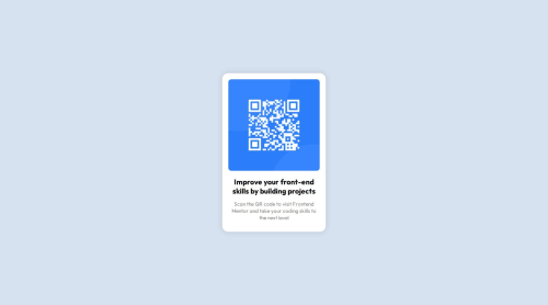
QR Code Page using HTML/CSS

Solution retrospective
Most proud of? That I actually managed to start and complete the project! Differently next time? Use proper REM or EM on my CSS if I mixed them up (still having trouble understanding it)
What challenges did you encounter, and how did you overcome them?Changing/downloading the fonts, using GitHub for the first time, making a Live Site URL!
I used YouTube and carefully read GitHub instructions, as well as following the "Complete guide to submitting solutions"!
What specific areas of your project would you like help with?Seeing if I used correctly the REM and EM on my CSS, any simpler ways to shorten my CSS code and make it simpler (if possible) and does it look like a junior working in the programming field made it? lol
Please log in to post a comment
Log in with GitHubCommunity feedback
No feedback yet. Be the first to give feedback on Alejandro Rodriguez's solution.
Join our Discord community
Join thousands of Frontend Mentor community members taking the challenges, sharing resources, helping each other, and chatting about all things front-end!
Join our Discord